
You’ve spent weeks perfecting your WordPress site on your desktop. The layout looks crisp, images pop, and everything loads beautifully. Then you grab your phone, pull up your site, and… disaster. Text overlaps, buttons are impossible to tap, and your visitors are bouncing faster than you can say “mobile-first indexing.”
Sound familiar?
Here’s the truth: WordPress mobile SEO isn’t just a nice-to-have anymore—it’s the foundation of your entire search strategy. Google’s been mobile-first since 2019, meaning they rank your site based on how it performs on smartphones, not desktops. If your mobile experience sucks, your rankings will too.
But here’s the good news: optimizing WordPress for mobile doesn’t require a computer science degree or a massive budget. In this guide, I’ll walk you through everything you need to dominate mobile search, from choosing the right theme to squeezing every millisecond out of your load times.
Let’s fix your mobile SEO before your competitors do.
Table of Contents
ToggleWhy Does WordPress Mobile SEO Actually Matter?
Look at your Google Analytics right now. I’ll wait.
Chances are, 60-80% of your traffic comes from mobile devices. That’s not a trend—it’s the new normal. And if those mobile visitors are greeted with a clunky, slow-loading mess, they’re gone in seconds.
Google knows this. That’s why they switched to mobile-first indexing for all websites. Your desktop version? Google barely glances at it anymore. Your mobile version is now your real website in Google’s eyes.
Here’s what poor mobile optimization costs you:
- Lower search rankings (Google literally penalizes bad mobile experiences)
- Higher bounce rates (users leave faster than you can track them)
- Lost revenue (mobile commerce is exploding, and you’re missing out)
- Decreased engagement (nobody reads cramped, unformatted text on a 6-inch screen)
The mobile optimization stakes have never been higher. Let’s make sure you’re winning.
What Is Mobile-First Indexing and How Does It Affect WordPress?
Remember when Google used to rank websites based on their desktop versions? Yeah, those days are dead.
Mobile-first indexing means Google’s bots now primarily crawl and index the mobile version of your WordPress site. If your mobile site is missing content, has different URLs, or loads slower than molasses, Google sees that as the “real” version of your site.
Here’s what this means for your WordPress site:
The content on your mobile version needs to match your desktop version. If you’re hiding sections on mobile to “clean up” the design, Google might not even see that content. Same goes for structured data, metadata, and everything else that helps you rank.
Your mobile site speed becomes critical. Google’s Core Web Vitals—which directly impact rankings—are measured on mobile devices. A slow mobile site tanks your rankings across all devices.
Pro Tip: Use Google Search Console to check if your site has migrated to mobile-first indexing. Navigate to Settings > Crawler > Googlebot smartphone. If that’s your primary crawler, you’re already in mobile-first mode.
Want to dive deeper into WordPress SEO fundamentals? Check out the complete WordPress SEO guide for more strategies.
How Do I Know If My WordPress Site Is Mobile-Friendly?
Before we optimize anything, let’s figure out where you stand. Testing your mobile readiness takes about 3 minutes and reveals exactly what’s broken.
Quick Mobile Testing Methods
Google’s Mobile-Friendly Test is your first stop. Head to the Google Mobile-Friendly Test tool, drop in your URL, and wait for the verdict. Google will show you exactly how your page appears on mobile devices and flag any usability issues.
PageSpeed Insights gives you the full picture. This tool tests both mobile and desktop performance, showing you real user data (if you have enough traffic) plus lab data. Pay close attention to the mobile scores—anything under 50 is emergency territory.
Real device testing beats everything. Grab your phone and actually use your site. Try to:
- Tap buttons and links (are they big enough?)
- Read body text (is it readable without zooming?)
- Fill out forms (do they work properly?)
- Navigate menus (are they accessible?)
Common Mobile Issues WordPress Sites Face
Unresponsive themes are still shockingly common. Some older WordPress themes simply weren’t built for mobile. They look fine on desktop but completely break on phones.
Oversized images murder mobile performance. That beautiful 4000px header image? It’s killing your load time and eating your visitors’ data plans.
Intrusive pop-ups get you penalized. Google specifically targets interstitials that cover the main content on mobile devices. If your pop-up appears immediately and covers the screen, you’re hurting your rankings.
Tiny tap targets frustrate users. Buttons and links need to be at least 48×48 pixels with adequate spacing. Anything smaller and users will rage-quit trying to click them.
What’s the Best Way to Make WordPress Mobile-Responsive?
Responsive design is non-negotiable. Your site needs to automatically adapt to any screen size—phone, tablet, desktop, whatever. Thankfully, WordPress makes this relatively painless.
Choosing a Mobile-Responsive WordPress Theme
Your theme is your foundation. Choose wrong here, and you’ll be fighting uphill battles forever.
Modern WordPress themes are responsive by default, but some are better than others. When evaluating themes, test them on real devices before committing. Here’s what separates good from great:
| Feature | Why It Matters | What to Look For |
|---|---|---|
| Clean Code | Faster loading, fewer bugs | Lightweight framework, minimal dependencies |
| Touch-Friendly Elements | Better user experience | Large buttons, adequate spacing |
| Optimized Images | Faster load times | Built-in lazy loading, responsive images |
| Mobile Menu | Easy navigation | Hamburger menu or similar mobile navigation |
| Page Builder Compatibility | Flexibility without breaking mobile | Works well with Elementor, Gutenberg |
Popular responsive WordPress themes that actually work:
- GeneratePress – Lightning fast, extremely lightweight, perfect for mobile
- Astra – Highly customizable, excellent mobile performance out of the box
- Kadence – Modern, fast, built specifically for Core Web Vitals
- Neve – AMP-ready, excellent mobile scores by default
Pro Tip: Before buying a premium theme, check its mobile demo on your actual phone. Demos lie, but real devices don’t.
Responsive Design vs. Mobile-Specific Site vs. AMP
Let’s clear up the confusion around different mobile approaches:
| Approach | How It Works | Pros | Cons | Best For |
|---|---|---|---|---|
| Responsive Design | One site adapts to all screens | Easy maintenance, one URL, Google’s favorite | Can be slower if not optimized well | Most WordPress sites |
| Mobile-Specific Site | Separate mobile version (m.example.com) | Highly customized mobile experience | Duplicate content issues, harder to maintain | Large enterprises with resources |
| AMP (Accelerated Mobile Pages) | Stripped-down HTML for instant loading | Extremely fast, Google loves it | Limited design, reduced functionality | News sites, blogs |
My honest take? Go with responsive design for 95% of WordPress sites. It’s what Google recommends, it’s easier to maintain, and modern WordPress themes nail it.
AMP is controversial in the WordPress community. It makes pages load insanely fast, but you sacrifice design flexibility and some functionality. Google officially said AMP isn’t a ranking factor, but faster pages are. If you can achieve great mobile speed without AMP (which is totally doable), skip it.
For a comprehensive breakdown of WordPress optimization techniques, explore the full WordPress SEO guide.
How Can I Speed Up My WordPress Mobile Site?
Mobile speed isn’t just about user experience—it’s a direct ranking factor. Google’s Core Web Vitals measure mobile performance, and slow sites get pushed down in search results.
The average mobile site takes 15+ seconds to fully load. Your target? Under 3 seconds. Here’s how to get there.
Essential WordPress Mobile Speed Optimization
Choose fast hosting first. Your hosting provider matters more than almost anything else. Cheap shared hosting will sabotage your mobile speed before you even start. Look for hosts that offer:
- SSD storage (faster than traditional HDDs)
- PHP 8.0+ (significantly faster than older versions)
- Server-level caching
- CDN integration
Recommended WordPress hosting for mobile speed: WP Engine, Kinsta, Cloudways, or SiteGround (for budget-conscious folks).
Use a caching plugin. Caching serves pre-generated HTML instead of processing PHP for every visitor. It’s the biggest speed boost you’ll get from a single plugin.
- WP Rocket – Premium but worth every penny, mobile-specific optimization built in
- LiteSpeed Cache – Free, incredibly powerful, works with LiteSpeed servers
- W3 Total Cache – Free, complex but comprehensive
Pro Tip: Enable mobile-specific caching in your plugin settings. Mobile users need different cached versions than desktop users.
Image Optimization for Mobile Devices
Images are usually the biggest performance killer on mobile sites. A single unoptimized hero image can add 5+ seconds to your load time.
Serve responsive images using WordPress’s built-in srcset feature. This automatically serves appropriately-sized images based on the user’s screen. Most modern themes handle this automatically, but verify yours does.
Implement lazy loading so images only load when users scroll to them. WordPress has native lazy loading since version 5.5, but plugins like WP Rocket or Smush can enhance it.
Use next-gen formats like WebP, which are 25-35% smaller than JPEGs without quality loss. The WebP Express plugin handles conversion automatically.
Image optimization plugins that work:
- ShortPixel – Aggressive compression, CDN included, excellent mobile results
- Imagify – User-friendly, great compression, good free tier
- Smush – Solid free option, handles lazy loading and resizing
Mobile-Specific Core Web Vitals Optimization
Google’s Core Web Vitals are measured primarily on mobile. Here’s what they mean and how to fix them:
Largest Contentful Paint (LCP) – How fast your main content loads (target: under 2.5 seconds)
- Optimize your hero images
- Use a fast hosting provider
- Implement critical CSS
- Preload key resources
First Input Delay (FID) – How quickly your site responds to user interactions (target: under 100ms)
- Minimize JavaScript execution
- Remove unused scripts
- Defer non-critical JS
- Use a lightweight theme
Cumulative Layout Shift (CLS) – How much your content jumps around while loading (target: under 0.1)
- Set dimensions for images and videos
- Reserve space for ads
- Don’t inject content above existing content
- Use font-display: swap for web fonts
Pro Tip: Google Search Console shows your actual Core Web Vitals performance. Check the Core Web Vitals report to see which pages need work.
What Technical WordPress Mobile SEO Factors Should I Optimize?
Beyond speed and responsiveness, several technical factors make or break your WordPress mobile SEO performance.
Mobile-Friendly Navigation and Menu Design
Mobile navigation is an art. Your desktop mega-menu won’t work on a 6-inch screen, and users shouldn’t have to pinch and zoom to find your contact page.
Implement a hamburger menu for mobile devices. Most modern themes do this automatically, but verify yours does. The menu icon should be:
- Clearly visible (top-left or top-right corner)
- At least 48×48 pixels
- Labeled with “Menu” text for clarity
Limit menu depth to 2-3 levels maximum on mobile. Deep nested menus are navigation nightmares on phones. Flatten your structure or create a separate simplified mobile menu.
Make your search function prominent on mobile. Users often prefer searching over navigating on mobile devices. Put a search icon in your mobile header.
Optimizing Forms and CTAs for Mobile Users
Forms are conversion killers on mobile if they’re not optimized. Every extra tap costs you signups and sales.
Use mobile-friendly form plugins:
- WPForms – Excellent mobile layouts, conditional logic
- Gravity Forms – Powerful but expensive, great mobile rendering
- Fluent Forms – Free, fast, mobile-optimized by default
Mobile form optimization best practices:
- Use large input fields (minimum 16px font size to prevent zoom)
- Enable autofill and autocomplete
- Use appropriate input types (tel for phone, email for email)
- Minimize required fields
- Use single-column layouts
- Add clear error messages
Make CTAs impossible to miss:
- Buttons should be at least 48×48 pixels
- Use high-contrast colors
- Add plenty of white space around buttons
- Use action-oriented text (“Get Your Free Guide” not “Submit”)
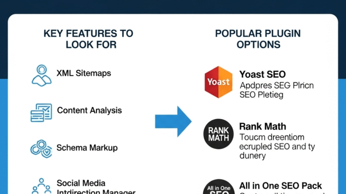
Structured Data and Schema Markup for Mobile
Structured data helps you win featured snippets and rich results on mobile search—where screen real estate is precious.
Implement these schema types for better mobile visibility:
- Article schema – For blog posts (shows publish date, author)
- FAQ schema – Creates expandable FAQ rich results
- HowTo schema – Step-by-step guides get special formatting
- Local Business schema – Critical for local SEO on mobile
- Product schema – Shows prices and ratings in search results
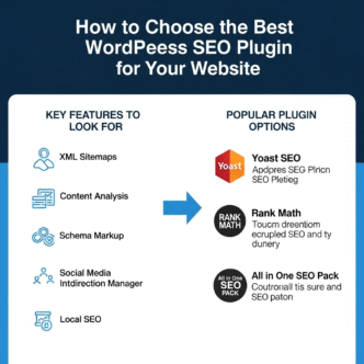
Use these WordPress schema plugins:
- Rank Math – Excellent schema implementation, free
- Schema Pro – Premium, extensive schema types
- WPSSO – Comprehensive but complex
For more details on implementing structured data, check the WordPress SEO guide.
How Do I Optimize WordPress Content for Mobile Users?
Writing for mobile isn’t the same as writing for desktop. Mobile users scan quickly, have shorter attention spans, and consume content differently.
Mobile Content Formatting Best Practices
Keep paragraphs short—2-3 sentences maximum. You’re reading this on mobile right now, and notice how these bite-sized paragraphs are easy to scan? That’s intentional.
Use plenty of white space to give mobile readers’ eyes a break. Cramped text is exhausting on small screens. Add space between paragraphs, around images, and between sections.
Break up content with subheadings every 200-300 words. Mobile users scroll fast, and descriptive H2 and H3 tags help them find what they need quickly.
Make text readable without zooming. Your body text should be at least 16px font size. Anything smaller forces users to pinch and zoom, which Google specifically penalights against.
Use bullet points and numbered lists liberally. They’re easier to scan on mobile than long paragraphs. Notice how this guide uses lists constantly? That’s a mobile-first approach.
Creating Mobile-First Content That Ranks
Front-load your important information. Mobile users might not scroll to the bottom, so put your key points and answers up top. This also helps with featured snippets.
Optimize your mobile-first content with natural keyword placement. Your focus keyword (like “WordPress mobile SEO”) should appear in:
- The first paragraph (done!)
- At least one H2 heading
- Throughout the content naturally
- Your meta description and title tag
Use long-tail keywords in your headings to capture voice search and conversational queries. Questions like “how to optimize WordPress site for mobile users” match exactly how people search on mobile.
Real-world example: A travel blog switched to mobile-first content formatting (shorter paragraphs, more subheadings, front-loaded answers). Their mobile bounce rate dropped from 73% to 51% within 30 days, and mobile rankings improved across 40+ keywords.
Mobile Video and Media Optimization
Video content dominates mobile, but heavy video files destroy mobile performance.
Host videos externally on YouTube or Vimeo instead of self-hosting. This saves bandwidth and prevents videos from tanking your page speed.
Use lazy loading for embedded videos so they only load when users scroll to them. Most caching plugins include this feature.
Provide video transcripts for accessibility and SEO. Google can’t watch your videos, but it can read transcripts. This is especially valuable for mobile users in sound-sensitive environments.
Pro Tip: Use the loading="lazy" attribute on your iframe embeds to prevent videos from blocking page rendering.
Should I Use AMP for My WordPress Mobile Site?
AMP (Accelerated Mobile Pages) is Google’s framework for creating lightning-fast mobile pages. It’s controversial, powerful, and not right for everyone.
Understanding AMP for WordPress
AMP strips down your HTML to bare essentials. It removes most JavaScript, limits CSS to 50KB, and enforces strict performance rules. The result? Pages that load almost instantly on mobile.
WordPress AMP implementation is easier than you think. The official AMP plugin by WordPress handles most of the heavy lifting, creating AMP versions of your pages automatically.
AMP Pros and Cons for WordPress Sites
| Advantages | Disadvantages |
|---|---|
| Insanely fast mobile loading – Often under 1 second | Limited design flexibility – Stripped-down appearance |
| Better mobile user experience – Smooth, responsive | Reduced functionality – Many plugins won’t work |
| Potential traffic boost – Some niches see improvements | Maintenance overhead – Two versions to manage |
| Lower server load – Cached by Google | Not a ranking factor – Google confirmed this |
| Works well for blogs – Simple content translates well | Poor for e-commerce – Complex features don’t work |
My honest recommendation? If you can achieve great mobile speed through traditional optimization (which is totally achievable with the right hosting, caching, and theme), skip AMP. The limitations often aren’t worth the speed gains.
But consider AMP if:
- You run a news or content-heavy site
- Your current mobile speed is terrible and you need a quick fix
- You’re willing to sacrifice design for performance
- Your content is relatively simple (articles, blog posts)
Skip AMP if:
- You run an e-commerce site (forms and complex interactions break)
- You heavily customize your design
- You rely on specific plugins that aren’t AMP-compatible
- You can achieve good mobile speed through standard optimization
Pro Tip: If you implement AMP, use “transitional” mode rather than “standard” mode. This lets you keep your regular mobile site while offering AMP versions when beneficial.
How Do Mobile-Specific Keywords and Search Intent Differ?
Mobile search behavior is fundamentally different from desktop. Understanding these differences is critical for WordPress mobile SEO success.
Mobile Search Intent and User Behavior
Mobile searches are more immediate and action-oriented. Someone searching on mobile is often looking to do something right now—find a nearby restaurant, check store hours, or solve an urgent problem.
Voice search dominates mobile. Over 50% of mobile searches now use voice, which means longer, more conversational queries. Best WordPress SEO plugins” becomes “Hey Google, what are the best SEO plugins for WordPress?
Local intent is stronger on mobile. “Near me” searches have exploded, with 76% of people who search for something nearby visiting a business within 24 hours.
Optimizing for Mobile and Voice Search
Target conversational long-tail keywords that match how people actually talk:
- How do I speed up my WordPress site on mobile?
- “Why is my WordPress site slow on phones?”
- “Best way to optimize WordPress for mobile users”
Create FAQ sections using actual questions people ask. These are gold for voice search and often appear in featured snippets on mobile. Use Question-style H2 tags (like this guide does) to match voice queries.
Optimize for local mobile search if you have any local component:
- Claim and optimize your Google Business Profile
- Include location-based keywords naturally
- Use local business schema markup
- Ensure your NAP (name, address, phone) is consistent everywhere
Pro Tip: Google’s “People Also Ask” boxes on mobile show you the exact questions users are asking. Use these as H2 and H3 headings in your content.
For comprehensive keyword research strategies, visit the WordPress SEO guide.
What Are the Best WordPress Mobile SEO Plugins?
Plugins can supercharge your mobile optimization efforts—or bloat your site if you choose poorly. Here’s what actually works.
Essential Mobile Optimization Plugins
Caching and performance plugins (pick ONE):
| Plugin | Best For | Key Mobile Features | Price |
|---|---|---|---|
| WP Rocket | Most users | Mobile-specific cache, lazy loading, mobile detection | $59/year |
| LiteSpeed Cache | LiteSpeed hosting users | Excellent mobile optimization, free CDN | Free |
| W3 Total Cache | Advanced users | Separate mobile cache, minification | Free |
Mobile-specific SEO plugins:
Rank Math – My top pick for WordPress mobile SEO. Includes mobile-specific schema, analyzes mobile usability, and integrates with Search Console to track mobile performance. Free version is excellent.
Yoast SEO – The classic choice, though I prefer Rank Math. Still solid for mobile optimization with decent mobile analysis features. Free version available.
Mobile menu plugins (if your theme’s menu sucks):
- WP Mobile Menu – Creates beautiful mobile menus with icons, search integration, and customization
- Responsive Menu – Highly customizable, works with any theme
- Max Mega Menu – Powerful but complex, great for large sites
Mobile testing and analysis:
- Query Monitor – Debug mobile-specific issues, check database queries
- WP Rollback – Quickly revert plugin updates that break mobile functionality
Pro Tip: Don’t install mobile-specific caching plugins AND general caching plugins together. Choose one excellent caching solution and stick with it.
Plugins to Avoid for Mobile Performance
Some popular plugins are mobile performance killers:
Heavy page builders like Divi and Visual Composer add massive JavaScript and CSS files. If you need a page builder, use Elementor with performance mode enabled, or better yet, stick with Gutenberg (WordPress’s native editor).
Social sharing plugins that load scripts from external servers. Each “share button” often loads 200KB+ of JavaScript. Use lightweight alternatives or hand-code simple sharing links.
Related posts plugins that query your database on every page load. Use your theme’s built-in related posts or a cached solution.
Too many tracking and analytics plugins slow everything down. Google Analytics covers 90% of what most sites need. Adding Hotjar, Crazy Egg, and five other analytics tools murders mobile performance.
How Can I Monitor and Improve WordPress Mobile SEO Performance?
You can’t improve what you don’t measure. Tracking your mobile optimization progress reveals exactly what’s working and what’s not.
Essential Mobile SEO Monitoring Tools
Google Search Console is your primary mobile SEO dashboard. It shows:
- Mobile usability issues (broken elements, viewport problems)
- Core Web Vitals performance for mobile
- Mobile search rankings and impressions
- Manual actions and mobile penalties
Check the “Mobile Usability” report monthly. Fix any issues immediately—Google’s telling you exactly what’s hurting your mobile rankings.
Google Analytics 4 tracks mobile user behavior:
- Mobile vs. desktop traffic split
- Mobile bounce rates and engagement
- Mobile conversion rates
- Device-specific performance
Set up custom mobile segments to analyze mobile users separately from desktop users. Their behavior is different, and your optimizations should reflect that.
PageSpeed Insights measures actual mobile performance using real user data. Test your key pages monthly and track improvements over time.
Real device testing remains crucial. Tools show data, but actually using your site on various phones reveals frustration points analytics miss.
Setting Up Mobile SEO Tracking
Create a mobile-specific dashboard in Google Analytics combining:
- Mobile traffic percentage
- Mobile bounce rate
- Mobile conversion rate
- Page load time by device
- Top mobile landing pages
Set up Core Web Vitals monitoring in Search Console. Check your “Experience” report monthly. Pages in the “Poor” category need immediate attention.
Track mobile keyword rankings separately from desktop. Many SEO tools (Ahrefs, SEMrush, Rank Math) let you segment mobile rankings. Your mobile rankings might differ significantly from desktop.
Monitor mobile click-through rates in Search Console. Mobile CTR is typically lower than desktop due to more competitive SERPs. Optimize your titles and descriptions specifically for mobile display.
What Are the Latest Mobile SEO Trends for WordPress in 2025?
The mobile optimization landscape evolves constantly. Staying current gives you a competitive edge.
AI-Powered Mobile Search and Optimization
AI search experiences are transforming mobile queries. Google’s AI Overviews (formerly SGE) now appear on mobile searches, often pushing traditional results down the page.
How to optimize for AI-powered mobile search:
- Focus on comprehensive, authoritative content that AI models can reference
- Use clear, structured formatting (AI loves well-organized content)
- Target question-based keywords that AI overviews answer
- Implement thorough schema markup so AI understands your content context
AI-powered Core Web Vitals optimization tools are emerging. Services like Cloudflare’s automatic optimization and NitroPack use machine learning to optimize mobile performance automatically.
Pro Tip: AI answers often cite sources. Creating authoritative, well-structured content increases your chances of being referenced in AI overviews on mobile.
Mobile-First E-commerce Optimization
Mobile commerce dominates—over 70% of e-commerce traffic now comes from mobile devices. WordPress e-commerce sites (WooCommerce especially) need aggressive mobile optimization.
Critical mobile e-commerce optimizations:
- One-page checkout (mobile users abandon multi-step checkouts)
- Mobile payment options (Apple Pay, Google Pay, Shop Pay)
- Persistent mobile cart (floating cart icon for easy access)
- Mobile-optimized product images (swipeable galleries, zoom functionality)
- Guest checkout (forcing account creation tanks mobile conversions)
WooCommerce mobile optimization plugins:
- WooCommerce Mobile App Builder – Creates native mobile app experiences
- Checkout Field Editor – Simplifies mobile checkout forms
- Direct Checkout – Skip cart page, reduce friction
Progressive Web Apps (PWAs) for WordPress
PWAs bridge the gap between websites and mobile apps. They work offline, can be “installed” on phones, and send push notifications—all without app store approval.
WordPress PWA benefits:
- Faster repeat visits (caching assets locally)
- Work offline or on poor connections
- Home screen installation increases engagement
- Push notifications bring users back
Implementing PWAs on WordPress:
- SuperPWA – Simple PWA functionality, free
- PWA for WordPress – Official plugin, basic features
- PWA Premium – Advanced features, better offline support
Real example: A WordPress news site implemented PWA functionality and saw mobile return visitor rates increase by 43% and mobile engagement time increase by 28%.
For advanced WordPress optimization strategies, explore the complete WordPress SEO guide.
Common WordPress Mobile SEO Mistakes to Avoid
Even experienced WordPress users make these mobile optimization blunders. Learn from their mistakes.
Critical Mobile SEO Errors
Serving different content on mobile vs. desktop confuses Google and violates mobile-first indexing principles. Your mobile content should match desktop content exactly.
Blocking CSS or JavaScript from mobile Googlebot prevents Google from rendering your pages properly. Check your robots.txt file and ensure mobile crawlers can access all resources.
Using Flash or other unsupported technologies makes your content invisible on mobile. Flash is dead—if you’re still using it anywhere, stop immediately.
Ignoring mobile Core Web Vitals while obsessing over desktop performance. Remember: Google ranks based on mobile performance now. Desktop scores matter less.
Installing too many mobile plugins trying to fix problems. More plugins = slower sites. Each plugin adds overhead. Choose quality over quantity.
Mobile UX Issues That Kill Rankings
Intrusive interstitials (full-screen pop-ups) trigger Google penalties on mobile. If you must use pop-ups, make them:
- Small banners rather than full-screen overlays
- Easy to dismiss (clear X button)
- Delayed until after the user engages with content
Tiny font sizes force users to pinch and zoom, which Google considers a poor mobile experience. Body text should be at least 16px.
Clickable elements too close together frustrate users. Buttons and links need at least 8-10px spacing between them on mobile.
Horizontal scrolling is almost always a bug. Your content should never require users to scroll sideways on mobile.
Pro Tip: Run monthly mobile usability audits using real devices. Have someone unfamiliar with your site try to complete key tasks on mobile. Their struggles reveal your UX problems.
How Do I Fix Common WordPress Mobile Speed Issues?
Despite your best efforts, mobile speed problems happen. Here’s how to diagnose and fix them.
Diagnosing Mobile Performance Problems
Use Chrome DevTools mobile emulation to see what’s actually loading:
- Open your site in Chrome
- Press F12 to open DevTools
- Click the device toggle icon (looks like a phone/tablet)
- Select a mobile device from the dropdown
- Switch to the Network tab and reload
This shows you every resource loading, how large it is, and how long it takes. Sort by size to find the biggest culprits.
WebPageTest.org offers advanced mobile testing with real devices. Use the “Advanced Settings” to:
- Test from mobile locations
- Test on real mobile devices
- Test on slower connections (3G, 4G)
- Get detailed waterfall charts
Search Console’s Core Web Vitals report shows Google’s actual mobile performance data from real users. This is the data that affects your rankings.
Quick Fixes for Common Speed Issues
Problem: Huge images killing load time
- Solution: Use ShortPixel or Imagify to bulk-optimize all existing images
- Set up automatic optimization for new uploads
- Enable lazy loading via WP Rocket or native WordPress
Problem: Render-blocking JavaScript
- Solution: Enable “Delay JavaScript Execution” in WP Rocket
- Move non-critical scripts to footer in your theme settings
- Use async or defer attributes on script tags
Problem: Excessive plugin bloat
- Solution: Use Query Monitor to identify slow plugins
- Deactivate plugins one by one and test mobile speed
- Replace heavy plugins with lightweight alternatives
Problem: No caching enabled
- Solution: Install WP Rocket or LiteSpeed Cache immediately
- Enable mobile-specific caching
- Set long cache expiration times
Pro Tip: Google’s Lighthouse tool in Chrome DevTools provides specific, actionable recommendations for fixing mobile performance issues. Don’t just look at the scores—read the actual suggestions.
WordPress Mobile SEO Checklist: Your Action Plan
Let’s consolidate everything into an actionable checklist you can implement today.
Immediate Mobile SEO Actions (Do These First)
✅ Test mobile-friendliness using Google’s Mobile-Friendly Test ✅ Check mobile speed with PageSpeed Insights (aim for 50+ on mobile) ✅ Verify mobile-first indexing status in Google Search Console ✅ Install a caching plugin (WP Rocket recommended) ✅ Enable lazy loading for images and videos ✅ Switch to a responsive theme if yours isn’t already ✅ Test on real mobile devices (iPhone and Android)
Advanced Mobile Optimization Tasks
✅ Implement mobile-specific schema markup (FAQ, HowTo, Article) ✅ Optimize Core Web Vitals for mobile (LCP < 2.5s, FID < 100ms, CLS < 0.1) ✅ Create mobile-friendly navigation (hamburger menu, simplified structure) ✅ Optimize forms for mobile (large fields, minimal required fields) ✅ Set up mobile analytics tracking (separate segments for mobile users) ✅ Review mobile keyword rankings and adjust content accordingly ✅ Test mobile checkout process (for e-commerce sites) ✅ Implement PWA features (optional but beneficial)
Ongoing Mobile SEO Maintenance
✅ Monthly mobile speed tests on key pages ✅ Review Search Console mobile usability reports ✅ Check Core Web Vitals progress monthly ✅ Monitor mobile rankings separately from desktop ✅ Test new content on mobile before publishing ✅ Update mobile-specific meta descriptions for better CTR ✅ Audit mobile pop-ups to ensure compliance
For a comprehensive WordPress optimization strategy, refer to the full WordPress SEO guide.
Real-World WordPress Mobile SEO Success Stories
Theory is great, but nothing beats actual results. Here’s what happens when you nail mobile optimization.
Case Study 1: Local Service Business
A plumbing company running WordPress with Astra theme struggled with mobile rankings. Their mobile PageSpeed score was 23, and mobile bounce rate was 81%.
Changes implemented:
- Switched to Cloudways hosting (SiteGround → Cloudways)
- Installed WP Rocket and optimized settings
- Compressed all images with ShortPixel
- Implemented local business schema
- Simplified mobile menu structure
- Added click-to-call buttons prominently on mobile
Results after 60 days:
- Mobile PageSpeed score: 23 → 89
- Mobile bounce rate: 81% → 47%
- Mobile organic traffic: +127%
- “Near me” keyword rankings improved from position 15-20 to 3-8
- Mobile conversion rate increased 3.4x
Case Study 2: E-commerce WordPress Site
An online jewelry store using WooCommerce had great desktop performance but terrible mobile experience. Mobile cart abandonment was 91%, and mobile revenue was only
12% despite 68% mobile traffic.
Changes implemented:
- Implemented one-page checkout with Checkout Field Editor
- Added Apple Pay and Google Pay options
- Optimized product images (WebP format, lazy loading)
- Reduced checkout form fields from 14 to 7
- Created mobile-specific product image galleries (swipe-friendly)
- Fixed mobile Core Web Vitals (LCP from 4.2s to 1.8s)
- Implemented persistent mobile cart icon
Results after 90 days:
- Mobile cart abandonment: 91% → 64%
- Mobile revenue percentage: 12% → 43% of total revenue
- Mobile PageSpeed score: 34 → 78
- Mobile conversion rate: +156%
- Average mobile session duration: +89%
The bottom line: Mobile revenue increased by $47,000 monthly, all from optimization changes that cost under $500 to implement.
Case Study 3: Content Blog
A WordPress blog about digital marketing had solid content but poor mobile engagement. Mobile users spent 40% less time on site compared to desktop users.
Changes implemented:
- Restructured all content with mobile-first formatting (shorter paragraphs)
- Added FAQ schema to all posts
- Implemented question-based H2 headings for voice search
- Created mobile-optimized featured images (vertical format)
- Added “jump to section” table of contents on mobile
- Reduced mobile ad density (removed 2 of 5 ad placements)
- Implemented infinite scroll for mobile users
Results after 45 days:
- Mobile time on site: +73%
- Mobile pages per session: 1.2 → 2.8 pages
- Featured snippet appearances on mobile: +340%
- Mobile organic traffic: +92%
- Voice search traffic: +215%
Pro Tip: The common thread in all these success stories? They prioritized actual mobile user experience over vanity metrics. Speed matters, but usability matters more.
FAQ: WordPress Mobile SEO Questions Answered
Let’s tackle the most common questions I get about WordPress mobile SEO.
Does mobile speed affect desktop rankings?
Yes and no. Google primarily uses your mobile site’s performance for ranking both mobile and desktop results (thanks to mobile-first indexing). However, if users primarily search for your content on desktop (B2B software tools, for example), desktop experience still influences rankings.
The practical answer: Optimize for mobile first, and your desktop rankings will likely improve too. Mobile-first doesn’t mean mobile-only.
Can I have different content on mobile vs desktop?
Technically yes, but you probably shouldn’t. Google uses the mobile version for indexing, so if content only appears on desktop, Google might not see it.
Acceptable differences:
- Collapsed/expandable sections (as long as content is still in HTML)
- Different image sizes (responsive images are fine)
- Simplified navigation (mobile-specific menus are okay)
Problematic differences:
- Completely hiding content on mobile
- Different URLs for mobile/desktop versions
- Removing important sections on mobile
Should I use a mobile-specific subdomain (m.example.com)?
No, unless you have a massive site with dedicated mobile developers. Responsive design is the modern standard and what Google recommends.
Mobile subdomains create duplicate content issues, split your link equity, and require maintaining two separate sites. It’s 2025—responsive sites work beautifully now.
How do I fix “Text too small to read” mobile errors?
This error appears in Google Search Console when your text is smaller than 12-16px on mobile. Here’s how to fix it:
- Check your theme’s mobile typography settings
- Add this CSS to ensure readable mobile text:
@media (max-width: 768px) {
  body, p { font-size: 16px !important; }
  h1 { font-size: 28px !important; }
  h2 { font-size: 24px !important; }
}
- Test on real devices to verify readability
- Request revalidation in Google Search Console
Does AMP improve mobile rankings?
Google has explicitly stated that AMP is not a ranking factor. However, faster pages are a ranking factor, and AMP pages are usually faster.
The nuance: If AMP helps you achieve significantly better mobile speed and Core Web Vitals, you might see ranking improvements. But you can achieve the same results through traditional mobile optimization without AMP’s limitations.
How long does mobile optimization take to impact rankings?
Google typically takes 2-4 weeks to re-crawl and re-evaluate your mobile site after major optimization changes. Core Web Vitals data takes longer—you need 28 days of real user data before Google fully incorporates it into rankings.
Realistic timeline:
- Week 1-2: Google re-crawls your improved mobile site
- Week 3-4: Initial ranking adjustments begin
- Week 5-8: Full impact visible in Search Console
- Month 3+: Continued improvements as user signals strengthen
Pro Tip: Request indexing in Google Search Console after making significant mobile improvements to speed up the process.
Can plugins slow down mobile performance?
Absolutely. Every plugin adds code, and many plugins are poorly optimized for mobile. Some plugins load full JavaScript libraries even when only using one function.
Heavy culprits:
- Page builders (except Gutenberg)
- Social sharing plugins with external scripts
- Analytics plugins beyond Google Analytics
- Security plugins with excessive checks
The solution: Regularly audit your plugins using Query Monitor. If a plugin adds more than 0.5s to your mobile load time, find a lighter alternative.
What’s the ideal mobile page size?
Target under 1.5MB total page size for mobile, with under 1MB being ideal. The average mobile page is 2.5MB, which is way too heavy.
Page size breakdown:
- Images: 500KB-800KB maximum (use optimization and lazy loading)
- JavaScript: Under 300KB
- CSS: Under 100KB
- HTML: Under 50KB
Use WebPageTest.org to analyze your actual mobile page weight.
Final Thoughts: Your WordPress Mobile SEO Journey
Here’s the truth nobody tells you: WordPress mobile SEO isn’t a one-time project. It’s an ongoing commitment to serving your mobile users better than your competitors do.
The mobile-first world isn’t coming—it’s already here. Google’s made it clear: your mobile experience IS your website now. Desktop is the afterthought.
But here’s the good news: most WordPress sites still suck on mobile. Your competitors are probably making the same mistakes you were making before reading this guide. That’s your opportunity.
Start with the basics:
- Get your mobile speed above 50 in PageSpeed Insights
- Make sure your theme is truly responsive
- Fix any mobile usability errors in Search Console
Then level up:
- Optimize your Core Web Vitals
- Implement mobile-specific schema markup
- Create mobile-first content that actually gets read
And keep improving:
- Monitor your mobile analytics monthly
- Test on real devices regularly
- Stay current with mobile SEO trends
The WordPress sites dominating mobile search in 2025 aren’t necessarily the biggest or most established. They’re the ones that understand mobile users and optimize relentlessly for mobile experience.
Your mobile visitors are worth the effort. Google’s algorithms reward the effort. Your rankings and revenue will reflect that effort.
Now stop reading and start optimizing. Your mobile users are waiting.
Want to master every aspect of WordPress SEO beyond just mobile? Check out the comprehensive WordPress SEO guide for strategies covering technical SEO, on-page optimization, link building, and more.
About the Author: This guide was created by SEO professionals who’ve optimized hundreds of WordPress sites for mobile-first performance. We’ve seen what works, what doesn’t, and what actually moves the ranking needle in 2025’s mobile-dominated search landscape.