Your competitor’s name is getting 10,000 searches per month. And guess what? Only 2% of those searchers end up choosing them.
The other 98%? They’re actively looking for alternatives—and if you’re not showing up in those searches, you’re leaving money on the table.
I’ve seen SaaS companies obsess over their product pages while completely ignoring SaaS comparison pages—the highest-converting content type you can create. These pages target prospects at the exact moment they’re ready to make a purchase decision.
Here’s the kicker: A single well-optimized comparison page can drive more trial signups than your entire blog combined. Why? Because people searching “[Competitor] alternatives” or “[Your Tool] vs [Competitor]” aren’t browsing—they’re shopping.
Today, I’m showing you exactly how to create high-converting comparison pages for SaaS that rank on Google and convert browsers into customers.
Table of Contents
ToggleWhy Are SaaS Comparison Pages Your Highest-ROI Content?
Let me hit you with some numbers that’ll change how you think about content strategy.
According to data from multiple SaaS companies I’ve worked with, product comparison pages convert at 5-10% on average—compared to 0.5-2% for educational blog content. That’s literally 10x better conversion rates.
But here’s what makes alternative pages for SaaS even more valuable: They target prospects who’ve already done their research. They know they need a solution. They’re comparing specific options. They have budget allocated.
These aren’t tire-kickers. They’re qualified buyers.
The psychology behind comparison searches:
When someone searches “Salesforce alternatives” or “HubSpot vs Pipedrive,” they’re telling you exactly where they are in the buying journey. They’re saying:
- “I’m actively evaluating options right now”
- “I have a problem that needs solving immediately”
- “Show me why I should choose you over others”
- “I’m ready to make a decision this week/month”
Understanding keyword research for SaaS helps you identify these high-intent comparison opportunities.
The Market Opportunity Is Massive
Here’s something wild: Your competitors are basically buying awareness for you through their marketing efforts. Every dollar they spend on ads and content builds recognition for their brand name.
Then you swoop in and capture the people searching for alternatives to them.
Real example: When “Mailchimp alternatives” gets 8,000+ monthly searches, that’s 8,000 people actively shopping for email marketing tools who are dissatisfied with the market leader. If you’re not ranking for that term, you’re invisible to qualified buyers.
Pro Tip: Your biggest competitors are doing you a favor by spending millions on brand awareness. Capitalize on their marketing spend by ranking for “[Competitor] alternatives” and “[Your Tool] vs [Competitor]” searches.
What Types of Comparison Pages Should You Create?
Not all competitor comparison content performs equally. Let’s break down the four types you need.
1. Alternative Pages (“Best [Competitor] Alternatives”)
These pages target searches from people looking for options besides a specific competitor.
Format: “Top 10 [Competitor] Alternatives for [Use Case]”
Example keywords:
- “best Asana alternatives for small teams”
- “Slack alternatives for enterprise”
- “Mailchimp alternatives for ecommerce”
Why they work: Capture broad intent from anyone dissatisfied with or researching alternatives to the market leader. Higher search volume than head-to-head comparisons.
Structure:
- Brief intro acknowledging why people look for alternatives
- Comparison table showing 8-12 alternatives
- Detailed write-ups for top 3-5 options (including you)
- Your tool prominently positioned (but honestly compared)
- Clear CTA to try your product
2. Head-to-Head Comparisons (“Tool A vs Tool B”)
Direct comparisons between two specific products.
Format: “[Your Tool] vs [Competitor]” or “[Competitor 1] vs [Competitor 2]”
Example keywords:
- “Monday vs Asana”
- “HubSpot vs Salesforce”
- “Zoom vs Microsoft Teams”
Why they work: Ultra-specific intent. People searching these are literally comparing their final two options. Conversion rates often hit 8-12%.
Structure:
- Quick summary of key differences
- Side-by-side feature comparison table
- Pricing comparison
- Use case recommendations (“Choose X if…, Choose Y if…”)
- Pros/cons for each tool
- Real customer testimonials or reviews
3. Category Alternative Pages (“Best [Tool Category]”)
Broader pages capturing people exploring a solution category.
Format: “Best [Tool Category] for [Specific Need]”
Example keywords:
- “best CRM for real estate agents”
- “top project management tools for agencies”
- email marketing platforms for Shopify stores
Why they work: Capture prospects earlier in evaluation before they’ve narrowed to specific tools. Opportunity to position your product as the category leader.
Structure:
- Criteria for evaluating tools in this category
- Comparison table with 10-15 options
- Detailed reviews of top 5-8 tools
- Buying guide section
- Your tool positioned strategically
4. Migration Pages (“Switch from [Competitor] to [Your Tool]”)
Content helping users migrate from competitors to your platform.
Format: “How to Switch from [Competitor] to [Your Tool]” or “Migrating from [Competitor]: Complete Guide”
Example keywords:
- “migrate from Trello to Monday”
- “switch from Mailchimp to ConvertKit”
- “move data from Salesforce to Pipedrive”
Why they work: Lower volume but extremely high intent. These people have already decided to switch—you’re just making it easier.
Structure:
- Why people switch
- Step-by-step migration guide
- Data export/import instructions
- Common migration challenges and solutions
- Success stories from switchers
Learning about SaaS SEO strategy shows how comparison pages fit into your overall growth approach.
How Do You Create High-Converting SaaS Comparison Pages?
Let’s get tactical with best practices for SaaS vs competitor pages that actually convert.
Start with Honest, Fair Comparisons
This is where most SaaS companies screw up. They create obviously biased comparison pages that feel like sales pitches. Prospects smell BS immediately and bounce.
The counterintuitive truth: Being genuinely fair in comparisons actually increases conversion rates.
Here’s why: If you acknowledge where competitors excel and where you excel, readers trust your assessment. They think “this company is being honest with me” rather than “this is marketing fluff.”
How to be fair while highlighting your strengths:
- Acknowledge competitor advantages genuinely
- Position your differences as “better for specific use cases” not “universally superior”
- Use neutral language in feature descriptions
- Include real customer quotes, not made-up testimonials
- Show pricing honestly (with any caveats)
Pro Tip: Have someone outside your marketing team review your comparison pages. If they feel the page is biased, your prospects will too. Aim for “helpful buying guide” not “sales pitch disguised as comparison.”
Create Comprehensive Feature Comparison Tables
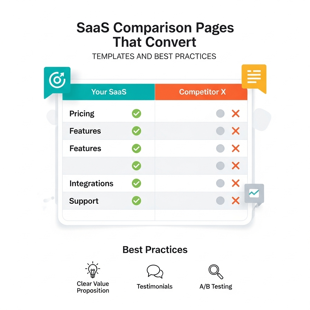
The comparison table is the most important element on your page. Get this wrong and nothing else matters.
Essential table structure:
| Feature | Your Tool | Competitor A | Competitor B |
|---|---|---|---|
| Core Feature 1 | ✅ Included | ✅ Included | ❌ Not available |
| Core Feature 2 | ✅ Advanced | ⚠️ Basic | ✅ Included |
| Integration X | ✅ Native | ⚠️ Third-party | ✅ Native |
| Pricing Start | $29/mo | $49/mo | $39/mo |
| Free Trial | 14 days | 7 days | 30 days |
| Support | 24/7 Chat | Email only | Business hours |
Table best practices:
- Lead with features where you’re strongest
- Use checkmarks (✅), X marks (❌), and warnings (⚠️) for quick scanning
- Include pricing in the table
- Show 4-8 key differentiators, not 50 features
- Make your column stand out visually (subtle highlight, not obnoxious)
- Include links to each competitor’s site (builds trust)
Write Clear Use Case Recommendations
Don’t force readers to figure out which tool is best for them. Tell them explicitly.
“Choose [Your Tool] if you…”
- Need [specific capability you excel at]
- Work in [industries where you’re strongest]
- Value [your key differentiator] over [competitor strength]
- Have [specific team size or use case]
“Choose [Competitor] if you…”
- Already use [their ecosystem]
- Need [feature where they’re stronger]
- Prefer [their approach to problem]
- Have [budget/requirements where they fit better]
This framework shows you understand different needs and aren’t just claiming universal superiority.
Real example: Notion honestly recommends competitors like Confluence for enterprise companies needing specific compliance features. This transparency builds trust with their target SMB audience.
Optimize Pricing Comparisons Carefully
Pricing comparisons drive conversions but require finesse.
How to show pricing fairly:
- Compare equivalent tiers (don’t compare your Pro to their Enterprise)
- Note what’s included at each price point
- Mention free trial availability and terms
- Include any setup fees or hidden costs
- Update regularly (competitors change pricing)
- Link to current pricing pages
Pro Tip: If your pricing is higher, frame it around value and ROI. Show total cost of ownership, not just monthly subscription. If you’re cheaper, emphasize that but also justify with features (avoid looking “budget option”).
Include Real Customer Social Proof
Generic testimonials kill conversion. Specific proof builds it.
What works:
- G2/Capterra review excerpts with names and companies
- Video testimonials from recognizable brands
- Specific metrics (“reduced churn by 40%”)
- Before/after migration stories
- Case studies from companies that switched
What doesn’t work:
- Anonymous quotes
- Generic praise (“great tool!”)
- Obviously cherry-picked reviews
- Fake-sounding testimonials
- No social proof at all
Understanding content marketing strategy helps you create comparison pages that support the broader buyer journey.
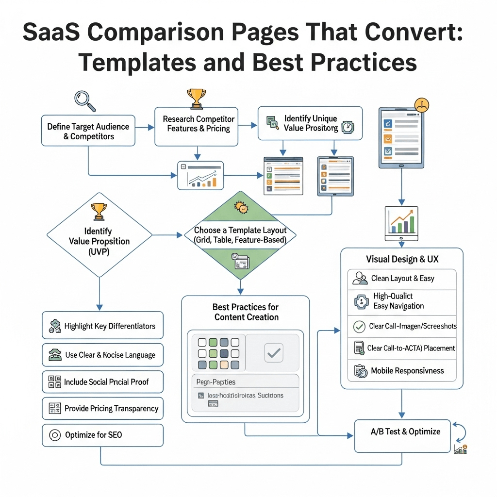
What’s the Best Comparison Page Template for Software Companies?
Here’s my proven comparison page template for software companies that you can adapt.
Section 1: Above-the-Fold Summary
Components:
- Clear H1: “[Your Tool] vs [Competitor]: Which Is Best for [Use Case]?”
- 2-3 sentence summary of key differences
- Quick comparison table (3-4 key features only)
- Primary CTA (Start free trial)
Example opening:
“[Your Tool] and [Competitor] are both powerful [solution type], but they serve different needs. [Your Tool] excels at [your strength] while [Competitor] focuses on [their strength]. This comparison helps you choose the right fit for [target audience].”
Section 2: Quick Comparison Table
Visual comparison showing 6-8 key differentiators.
Include:
- 3-4 features where you’re stronger
- 1-2 features where they’re stronger (builds trust)
- Pricing starting points
- Trial/demo availability
- Support options
Section 3: Detailed Feature Comparisons
Break down into subsections:
Feature Category 1 (e.g., Core Functionality)
- How your tool handles this
- How competitor handles this
- Real-world use case examples
Feature Category 2 (e.g., Integrations)
- Your integration ecosystem
- Their integration ecosystem
- Why this matters for users
Feature Category 3 (e.g., User Experience)
- Your UX approach
- Their UX approach
- Screenshots showing the difference
Continue for 4-6 key feature categories relevant to your audience.
Section 4: Pricing Comparison
Table showing:
- Tier names and monthly costs
- What’s included at each tier
- Annual vs monthly pricing
- Enterprise pricing approach
- Free trial/freemium details
Narrative explanation: Walk through total cost of ownership, not just sticker price. Include considerations like:
- Onboarding costs
- Training requirements
- Add-on pricing
- Scalability costs
Section 5: Use Case Recommendations
“Choose [Your Tool] if…” (4-6 specific scenarios)
“Choose [Competitor] if…” (3-4 specific scenarios)
“Consider alternatives if…” (2-3 scenarios where neither is ideal)
This honest assessment builds massive trust.
Section 6: Real Customer Reviews
Pull recent reviews from G2, Capterra, or TrustRadius for both products.
Show:
- 3-4 positive reviews for your tool
- 1-2 positive reviews for competitor (yes, really)
- Common complaints about competitor (from actual reviews)
- How your tool addresses those complaints
Pro Tip: Link directly to your review profiles. Let readers verify you’re being honest about the reviews you’re sharing.
Section 7: Migration/Getting Started
Make it easy to switch:
- “How to migrate from [Competitor]” section
- Import tools you offer
- Migration timeline
- Support you provide during onboarding
Section 8: Strong CTA Section
Multiple CTA options:
- Primary: Start free trial (if you offer one)
- Secondary: Schedule demo (for enterprise/complex products)
- Tertiary: Download comparison guide PDF (email capture)
Closing paragraph: Summarize key decision factors and encourage action. Don’t end weakly—give them a reason to act now.
How Do You Rank for Alternative Keywords in SaaS?
Let’s tackle how to rank for alternative keywords in SaaS with actual SEO tactics.
Keyword Research for Comparison Pages
High-value comparison keyword patterns:
Alternative keywords:
- “[Competitor] alternatives”
- “best [Competitor] alternatives”
- “[Competitor] alternatives for [use case]”
- “tools like [Competitor]”
- “similar to [Competitor]”
Versus keywords:
- “[Tool A] vs [Tool B]”
- “[Tool A] versus [Tool B]”
- “[Tool A] compared to [Tool B]”
- “difference between [Tool A] and [Tool B]”
Category keywords:
- “best [tool category] like [Competitor]”
- “[tool category] similar to [Competitor]”
- “[Competitor] competitors”
Pro Tip: Use Ahrefs or SEMrush to find the exact keywords your competitors‘ brand names rank for. Search for “[Competitor Name]” in the keyword explorer and filter for keywords containing “alternative,” “vs,” or “competitor.”
On-Page SEO for Comparison Pages
Title tag formula: “[Your Tool] vs [Competitor]: Honest Comparison for [Year]”
Keep under 60 characters. Include year for freshness signal.
Meta description: Summarize key differences in 155 characters. Include CTA and mention free trial if offered.
H1 structure: Use primary keyword naturally: “[Your Tool] vs [Competitor]: Which Is Better for [Use Case]?”
H2 subheadings with keywords:
- “Quick Comparison: [Your Tool] vs [Competitor]”
- “[Your Tool] Features and Pricing”
- “[Competitor] Features and Pricing”
- “Best [Competitor] Alternatives to Consider”
- “How to Switch from [Competitor] to [Your Tool]”
Internal linking:
- Link to your main product page
- Link to specific feature pages mentioned in comparison
- Link to case studies of companies that switched
- Link to other comparison pages (build comparison page cluster)
External linking: Yes, link to competitors’ sites and pricing pages. It builds trust and Google expects comparison pages to reference what they’re comparing.
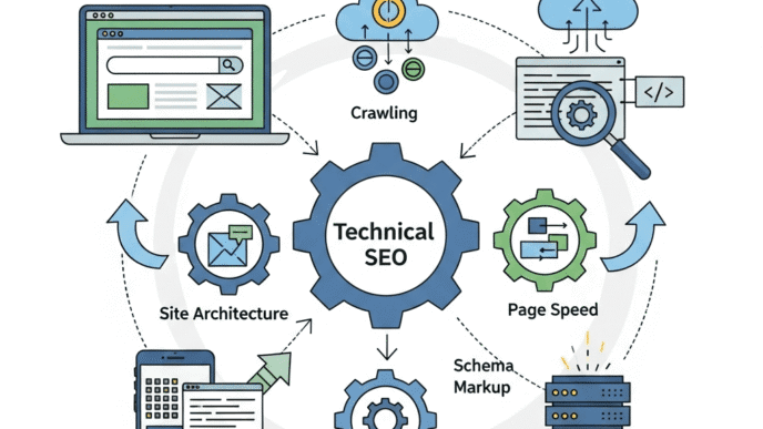
Technical SEO for Comparison Pages
Schema markup: Implement <a href=”https://schema.org/Product” rel=”nofollow”>Product schema</a> for both tools being compared.
Include:
- Product name
- Description
- Aggregate ratings (if available)
- Offers (pricing information)
Update frequency: Google favors fresh content. Update comparison pages quarterly:
- Refresh pricing information
- Update feature comparisons (products evolve)
- Add recent customer reviews
- Change “for 2024” to “for 2025” etc.
- Add new screenshots if UIs have changed
Pro Tip: Set calendar reminders to update your top 20 comparison pages every 3 months. This freshness signal helps maintain and improve rankings.
Learning about technical SEO fundamentals ensures your comparison pages are crawlable and indexable.
Building Links to Comparison Pages
Comparison pages naturally earn fewer backlinks than educational content, but you can still build them strategically.
Link building tactics:
1. Competitor mention monitoring: Set up alerts (using Ahrefs or Mention) for when competitors get mentioned online. Reach out suggesting your comparison page as additional resource.
2. HARO and journalist queries: Respond to queries about tool comparisons in your space. Include links to your comprehensive comparison pages.
3. Update old comparison content: Find outdated comparison posts (published 2+ years ago) linking to competitors. Suggest your updated comparison as better resource.
4. Reddit and community answers: When people ask “What’s better than [Competitor]?” on Reddit or Quora, provide genuinely helpful answers linking to your comparison page (don’t spam).
5. Guest posts with embedded links: Write about “How to Choose [Tool Type]” for industry blogs, naturally linking to your detailed comparison pages.
Real example: ClickUp earned hundreds of backlinks to their comparison pages by creating the most comprehensive head-to-head comparisons in the project management space. Other sites naturally reference these as the authoritative source.
What Are Common Mistakes to Avoid in Writing Honest Competitor Comparisons?
Let me save you from the biggest pitfalls I see in versus pages SEO.
Mistake #1: Being Obviously Biased
The problem: Making comparison pages that are thinly-veiled sales pitches. Every single comparison point favors your tool.
Why it kills conversion: Readers aren’t stupid. They know you’re biased toward your product. But if you pretend you’re not biased at all, they’ll distrust everything on the page.
The fix: Acknowledge 2-3 areas where competitors genuinely excel. This paradoxically increases trust in areas where you claim superiority.
Mistake #2: Comparing Unequal Tiers
The problem: Comparing your Pro plan against competitor’s Basic plan to make pricing look better.
Why it kills conversion: Savvy buyers spot this immediately and lose trust in your entire comparison.
The fix: Compare equivalent tiers based on features and user limits, not just names. Note when you’re comparing different tiers and why.
Mistake #3: Using Outdated Information
The problem: Comparison pages from 2022 showing pricing and features from 2019.
Why it kills conversion: Nothing screams “we don’t maintain our content” like showing a competitor’s old pricing or missing their new features.
The fix: Review and update every comparison page quarterly. Add “Last updated: [Date]” at the top to show freshness.
Pro Tip: Set up free trials or demo accounts with competitors specifically to screenshot their current UI and verify features. Don’t rely on their public marketing pages—test the actual product.
Mistake #4: Ignoring Mobile Experience
The problem: Massive comparison tables that don’t render on mobile devices.
Why it kills conversion: Over 60% of comparison searches happen on mobile. If your table is unreadable, they’ll hit back and choose a competitor’s comparison page.
The fix: Use responsive tables that stack vertically on mobile or implement accordion-style comparisons for small screens.
Mistake #5: Weak or Generic CTAs
The problem: Ending the page with “Learn More” or generic “Sign Up” buttons.
Why it kills conversion: You’ve convinced them your tool is better but didn’t make the next step obvious.
The fix: Use specific CTAs based on page type:
- Comparison pages: “Try [Your Tool] Free for 14 Days”
- Alternative pages: “See Why [X Companies] Switched to [Your Tool]”
- Migration pages: “Start Your Migration from [Competitor] Today”
Mistake #6: Not Addressing Switching Costs
The problem: Ignoring the elephant in the room—switching tools is a pain.
Why it kills conversion: Even if your tool is better, inertia keeps people with current solutions unless you address switching friction.
The fix: Include dedicated section on:
- How long migration typically takes
- Import tools you offer
- Onboarding support provided
- Case studies of successful migrations
- What data transfers automatically
Real-World Examples of High-Converting Comparison Pages
Let’s analyze SaaS comparison pages that actually drive results.
ClickUp vs Asana (ClickUp’s Page)
What they did right:
- Comprehensive feature-by-feature breakdown
- Honest acknowledgment of Asana’s strengths
- Clear use case recommendations
- Real customer migration stories
- Updated quarterly with current information
Conversion elements:
- Multiple CTAs throughout (not just at end)
- Free trial prominent (no credit card required)
- Comparison table exports to PDF (lead magnet)
- Video walkthrough showing differences
Result: Ranks #1 for “ClickUp vs Asana” and drives consistent trial signups.
Mailchimp Alternatives (ConvertKit’s Page)
What they did right:
- Lists 12+ alternatives (shows comprehensive research)
- Positions different tools for different needs
- Doesn’t bash Mailchimp (acknowledges when it’s good fit)
- Detailed pricing breakdowns
- Creator-focused positioning (their niche)
Conversion elements:
- Email course opt-in for “Choosing Email Platform”
- Migration guide prominently featured
- Creator success stories throughout
- Specific recommendations by business type
Result: Ranks in top 3 for “Mailchimp alternatives” and captures creator market specifically.
HubSpot vs Salesforce (HubSpot’s Page)
What they did right:
- Acknowledges Salesforce’s enterprise strength
- Positions HubSpot for SMB and growth-stage companies
- Shows total cost of ownership (not just sticker price)
- Free CRM comparison prominent
- Multiple proof points (customer logos, reviews, awards)
Conversion elements:
- Free CRM trial (low friction entry)
- “Talk to Sales” for enterprise needs
- ROI calculator for comparing total costs
- Implementation timeline comparison
Result: Captures SMB buyers considering enterprise tools by acknowledging fit differences honestly.
Quick-Start Checklist: Your First Comparison Page
Ready to create your first alternative landing pages? Follow this checklist.
Research Phase (2-3 hours):
- [ ] Choose your primary competitor to compare against
- [ ] Sign up for their free trial/demo to test actual product
- [ ] Research their current pricing (all tiers)
- [ ] Read their G2/Capterra reviews (especially negative ones)
- [ ] List 8-10 key feature differences
- [ ] Identify 3-4 use cases where you’re clearly better
- [ ] Find 2-3 areas where they might be stronger (be honest)
Content Creation (4-6 hours):
- [ ] Write compelling H1 with target keyword
- [ ] Create summary comparison table (above fold)
- [ ] Write honest introduction acknowledging both tools
- [ ] Build detailed feature comparison section
- [ ] Create pricing comparison table
- [ ] Write use case recommendations section
- [ ] Add 3-5 customer testimonials or reviews
- [ ] Include migration guide section
- [ ] Write strong CTA with trial/demo options
Optimization Phase (1-2 hours):
- [ ] Optimize title tag and meta description
- [ ] Add internal links to relevant product pages
- [ ] Include external links to competitor site
- [ ] Add schema markup for products
- [ ] Optimize images with alt text
- [ ] Test mobile responsiveness
- [ ] Add tracking for conversion events
- [ ] Submit URL to Google Search Console
Promotion Phase (Ongoing):
- [ ] Share on relevant Reddit/Quora threads
- [ ] Email to customers who switched from competitor
- [ ] Include in your link building outreach
- [ ] Update quarterly with fresh information
- [ ] Monitor rankings and adjust based on performance
Pro Tip: Start with comparison pages for your top 3 competitors, then expand to top 10 over time. Quality beats quantity—one exceptional comparison page beats ten mediocre ones.
Frequently Asked Questions About SaaS Comparison Pages
Should we create comparison pages even if we’re smaller than competitors?
Absolutely. This is actually your advantage. Prospects searching for alternatives to big players are often frustrated with enterprise bloat, poor support, or high prices—areas where nimble startups excel. Position honestly as the focused, customer-centric alternative.
Is it legal to use competitor names on our pages?
Yes, comparative advertising is legal in most jurisdictions as long as you’re truthful and not disparaging. You can use competitor names, create comparison pages, and even use their names in your title tags. Just be honest and factual in your comparisons.
How many comparison pages should we create?
Start with your top 3-5 competitors, then expand based on search volume and strategic importance. Established SaaS companies often have 20-50+ comparison pages covering all major competitors and “best alternatives” variations.
What if our competitor is objectively better in some ways?
Acknowledge it honestly and position your tool for specific use cases where you excel. “Choose [Competitor] if you need [their strength]. Choose us if you value [your strength] instead.” This honesty increases trust and conversion from your ideal customers.
Should comparison pages be gated content?
No, make them publicly accessible for SEO. You can offer PDF downloads or detailed guides as gated content within the comparison page for email capture, but the main page should be ungated to rank and drive organic traffic.
How do we keep comparison pages updated?
Set quarterly reminders to review and update:
- Current pricing for all tools
- New features launched
- Changed UI (update screenshots)
- Recent customer reviews
- Refresh date at top of page
Outdated comparison pages kill trust and rankings.
What if competitors create comparison pages about us?
That’s actually validation you’re a serious player. Create your own version with your perspective. Don’t engage in comparison wars or badmouth their pages. Let the quality and honesty of your content speak for itself.
Final Thoughts: Your Comparison Page Strategy
SaaS comparison pages are the highest-leverage content you can create for your business. One exceptional comparison page can generate more pipeline than months of blog posts.
Start small. Create comparison pages for your top 3 competitors first. Make them genuinely helpful, brutally honest, and strategically optimized.
The key is balancing SEO optimization with genuine value. You’re not trying to trick Google—you’re trying to help real buyers make informed decisions.
Be honest about where competitors excel. Acknowledge when your tool isn’t the best fit for certain use cases. This counterintuitive transparency will increase your conversion rates because trust is the bottleneck in B2B buying decisions.
Most importantly, maintain these pages. Update them quarterly. Keep pricing current. Add new features. Refresh screenshots. Stale comparison pages lose rankings and kill trust.
Your competitors are spending millions to build brand awareness. Capitalize on that investment by capturing the people searching for alternatives.
The prospects are actively looking. The search volume is there. The conversion rates are proven. All you need to do is show up with genuinely helpful, honest comparison content.
Now stop reading and start creating. Your highest-converting content awaits.


