
You’re standing in line at Starbucks, scrolling through your phone, when you spot an interesting article. You tap the link, and… nothing. Then a loading spinner. Then more waiting. By the time the page finally loads (if it ever does), you’ve already ordered your coffee, received it, and probably forgotten why you wanted to read the article in the first place.
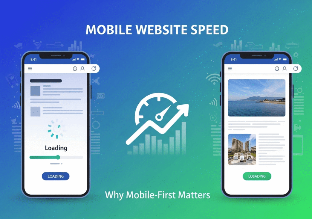
Welcome to the mobile web reality check! Mobile website speed isn’t just a nice-to-have feature anymore – it’s the difference between connecting with your audience and watching them disappear into the digital void. While you might have perfected your desktop experience, your mobile visitors are dealing with an entirely different beast.
Here’s the plot twist that catches many website owners off guard: Google now uses mobile page speed as the primary ranking factor, not desktop speed. It’s called mobile-first indexing, and it means your mobile performance literally determines your search rankings. Ready to discover why mobile optimization has become the make-or-break factor for online success?
Table of Contents
Toggle
Why Is Mobile Website Speed More Important Than Desktop?
Mobile website speed has taken the throne as the most critical performance metric because of a fundamental shift in how people use the internet. It’s like the difference between reading a book in a quiet library versus reading it on a crowded subway – the environment completely changes the experience requirements.
The Mobile-First Reality:
- 60%+ of web traffic comes from mobile devices
- Google’s mobile-first indexing prioritizes mobile performance for rankings
- Mobile users are less patient – they expect instant gratification
- Mobile context is different – users are often multitasking or on-the-go
Why Mobile Speed Matters More: Device limitations make every millisecond count. Mobile devices have:
- Less processing power than desktop computers
- Limited memory affecting browser performance
- Variable network connections from 5G to slow 3G
- Smaller screens requiring different optimization strategies
User behavior differences compound the importance:
- Shorter attention spans on mobile devices
- Higher abandonment rates for slow-loading pages
- More likely to bounce if loading takes too long
- Less forgiving of performance issues
Google’s Mobile-First Indexing Impact: Since 2019, Google primarily uses the mobile version of your site for indexing and ranking. This means mobile performance directly affects your search visibility more than desktop performance.
Pro Tip: Don’t assume your desktop performance translates to mobile. Mobile devices often perform 20-50% slower than desktop for the same website. Always test and optimize mobile performance separately.
How to Improve Mobile Page Speed: Essential Strategies
How to improve mobile page speed requires understanding the unique challenges mobile devices face and implementing targeted solutions. It’s like packing for a backpacking trip – every ounce matters, and you need to be strategic about what you include.
Mobile-Specific Image Optimization
Images for Mobile Devices Need Special Treatment:
Mobile Image Strategy:
- Serve smaller images to mobile devices (use responsive images)
- Compress more aggressively for mobile (users are more tolerant of slight quality loss)
- Use next-gen formats like WebP which mobile browsers support well
- Implement smart lazy loading that works with mobile scroll behavior
Mobile Image Sizes Guide:
<picture>
  <source media="(max-width: 480px)" srcset="image-mobile.webp 480w">
  <source media="(max-width: 768px)" srcset="image-tablet.webp 768w">
  <source media="(min-width: 769px)" srcset="image-desktop.webp 1200w">
  <img src="image-fallback.jpg" alt="Description" loading="lazy">
</picture>
Mobile-First Code Optimization
JavaScript and CSS for Mobile Performance:
Critical Mobile Optimizations:
- Minimize JavaScript execution – mobile CPUs struggle with heavy scripts
- Use critical CSS – load only essential styles first
- Defer non-essential resources – let the page render first
- Optimize touch interactions – ensure responsive user interface elements
Mobile CSS Strategy:
/* Mobile-first approach */
.container {
  /* Mobile styles (default) */
  font-size: 14px;
  padding: 10px;
}

@media (min-width: 768px) {
  .container {
    /* Tablet and desktop enhancements */
    font-size: 16px;
    padding: 20px;
  }
}
Network Connection Optimization
Adapting to Variable Mobile Connections:
Connection-Aware Loading:
- Detect connection speed and adapt content accordingly
- Implement progressive loading for slower connections
- Use compression more aggressively for mobile
- Minimize HTTP requests – each request is more expensive on mobile
Network-Adaptive Strategies:
// Basic connection detection
if (navigator.connection) {
  const effectiveType = navigator.connection.effectiveType;

  if (effectiveType === 'slow-2g' || effectiveType === '2g') {
    // Load minimal version
    loadBasicContent();
  } else {
    // Load full version
    loadEnhancedContent();
  }
}
Mobile Site Speed Best Practices: A Complete Guide
Mobile site speed best practices require a comprehensive approach that considers the entire mobile user journey. Think of it as creating a mobile-optimized highway – every element needs to be designed for efficiency and speed.
Core Mobile Performance Principles
The Mobile Speed Hierarchy:
- Content delivery speed (how fast users see something)
- Interaction responsiveness (how quickly they can use the page)
- Visual stability (preventing layout shifts during loading)
- Complete loading (when everything finishes loading)
Mobile-Specific Testing and Monitoring
Essential Mobile Testing Strategy:
| Testing Method | Focus Area | Tools | Frequency |
|---|---|---|---|
| Real Device Testing | Actual user experience | Physical devices | Weekly |
| Network Throttling | Various connection speeds | Chrome DevTools | Bi-weekly |
| Mobile Lab Testing | Core Web Vitals | PageSpeed Insights Mobile | Daily |
| Real User Monitoring | Actual visitor data | Analytics | Continuous |
Mobile Testing Checklist:
- Test on real devices with varying capabilities
- Simulate different network conditions (3G, 4G, WiFi)
- Check touch target sizes and usability
- Verify responsive design across screen sizes
- Monitor Core Web Vitals specifically for mobile
Advanced Mobile Optimization Techniques
Progressive Enhancement for Mobile: Build your site mobile-first, then enhance for larger screens and more capable devices.
Service Worker Implementation:
// Basic service worker for mobile caching
self.addEventListener('fetch', event => {
  if (event.request.destination === 'image') {
    event.respondWith(
      caches.open('images').then(cache => {
        return cache.match(event.request).then(response => {
          return response || fetch(event.request).then(fetchResponse => {
            cache.put(event.request, fetchResponse.clone());
            return fetchResponse;
          });
        });
      })
    );
  }
});
Mobile-Specific Resource Prioritization:
- Preload critical mobile resources (fonts, above-fold images)
- Defer desktop-specific features for mobile users
- Use intersection observer for efficient lazy loading
- Implement smart prefetching based on user behavior
Pro Tip: Mobile optimization is about progressive enhancement, not just responsive design. Start with a fast, functional mobile experience and enhance it for larger screens and more powerful devices.
Mobile Website Performance Optimization: Real-World Success
Let me share detailed examples of mobile website performance optimization that demonstrate the massive impact of mobile-focused improvements.
Case Study 1: E-commerce Fashion Retailer
The Challenge: An online clothing store noticed that mobile visitors were abandoning their shopping carts at alarming rates, despite strong desktop performance.
Initial Mobile Performance Issues:
- Mobile page load time: 7.8 seconds average
- Mobile bounce rate: 74%
- Mobile conversion rate: 0.9%
- Cart abandonment on mobile: 89%
- Mobile Core Web Vitals: All metrics in “Poor” category
Mobile-Specific Problems Discovered:
- Unoptimized product images: 3-5MB photos per product page
- Desktop-first design: Heavy animations and effects meant for large screens
- Poor touch optimization: Small buttons and links difficult to tap
- Heavy JavaScript: Complex product customization tools slowing mobile
- Inadequate mobile hosting: Server response times 3x slower for mobile
Mobile-First Optimization Strategy:
Phase 1: Mobile Image Revolution (Week 1)
- Created mobile-specific images: Optimized for small screens and touch viewing
- Implemented aggressive compression: 85% file size reduction for mobile
- Used WebP format: With JPEG fallbacks for older mobile browsers
- Added smart lazy loading: Images load just before users need them
Mobile Image Optimization Results:
- Page weight reduction: From 4.2MB to 890KB on mobile
- Initial load time: Improved from 7.8s to 4.1s
- User engagement: +34% increase in product image views
Phase 2: Mobile-First Code Optimization (Week 2)
- Rebuilt mobile CSS: Started with mobile styles, enhanced for desktop
- Simplified JavaScript: Removed desktop-specific interactive features for mobile
- Optimized touch targets: Made all buttons and links thumb-friendly
- Improved mobile navigation: Streamlined menu structure for small screens
Mobile UX Optimization Results:
- Page load time: Further improved to 2.8s
- Touch interaction success: +67% improvement in successful taps
- Mobile navigation: +45% increase in pages per mobile session
Phase 3: Mobile Infrastructure and Testing (Week 3)
- Mobile-optimized hosting: Dedicated mobile server configuration
- Advanced mobile caching: Aggressive caching strategy for mobile resources
- Progressive Web App features: Added offline functionality and app-like experience
- Continuous mobile testing: Set up real device testing lab
Final Mobile Performance Results:
- Mobile page load time: 1.9 seconds (76% improvement)
- Mobile Core Web Vitals: All metrics achieved “Good” status
- Mobile bounce rate: 31% (58% improvement)
- Mobile conversion rate: 2.8% (+211% improvement)
Business Impact After Mobile Optimization:
- Mobile revenue: +189% increase in mobile sales
- Overall revenue: +67% increase (mobile drove overall growth)
- Customer satisfaction: +78% improvement in mobile user ratings
- SEO rankings: +15 average position improvement for mobile searches
Key Insights from the Case Study: The retailer discovered that mobile users had completely different behavior patterns than desktop users. Mobile shoppers made faster decisions but needed simpler interfaces and instant loading. The optimization strategy that worked was designing specifically for mobile behavior, not just making the desktop site responsive.
Case Study 2: Local Service Business
The Challenge: A pest control company was losing potential customers because their mobile website was nearly unusable during emergency situations when people needed immediate help.
Initial Mobile Situation:
- Mobile load time: 9.3 seconds
- Mobile phone call conversion: 1.2%
- Mobile form completion: 0.4%
- Emergency service requests: Mostly going to competitors
Mobile User Context Understanding:
- Mobile users needed immediate help (pest emergencies)
- High-stress situations required instant information access
- Phone calls were primary goal for mobile visitors
- Local search dominated mobile traffic
Mobile-First Redesign Strategy:
Week 1: Emergency Mobile Experience
- Created mobile-specific homepage: Focused on phone number and emergency contact
- Simplified mobile content: Essential information only for mobile users
- Optimized for local search: Mobile-specific local SEO optimization
- Improved mobile call buttons: Large, obvious phone call actions
Week 2: Mobile Speed Optimization
- Aggressive mobile optimization: Removed all non-essential elements for mobile
- Mobile-first hosting: Upgraded to mobile-optimized server configuration
- Streamlined mobile forms: Emergency request form reduced to 3 fields
- Mobile caching strategy: Instant loading for return mobile visitors
Results After Mobile-First Redesign:
- Mobile load time: 1.6 seconds (83% improvement)
- Mobile phone call conversion: 8.9% (+642% improvement)
- Emergency service requests: +234% increase
- Mobile local search rankings: #1-3 for all target keywords
Business Impact:
- Monthly mobile leads: Increased from 12 to 67
- Emergency call revenue: +$89,000 additional monthly revenue
- Customer satisfaction: 94% of callers rated mobile experience as “excellent”
- Competitive advantage: Became the go-to mobile choice for pest emergencies
Pro Tip: This case study shows that mobile optimization isn’t just about speed – it’s about understanding mobile user context and optimizing for their specific needs and behaviors. Emergency service businesses especially benefit from mobile-first approaches.
Mobile Speed vs Desktop Speed: Understanding the Differences
Mobile speed vs desktop speed involves fundamental differences in hardware, software, and user context. Understanding these differences is crucial for effective mobile optimization.
Technical Differences Between Mobile and Desktop
Hardware Limitations Comparison:
| Aspect | Mobile Devices | Desktop Computers | Optimization Impact |
|---|---|---|---|
| CPU Power | Limited, battery-conserving | High-performance, plugged-in | High – mobile needs lighter code |
| RAM Memory | 2-8GB typical | 8-32GB typical | High – mobile needs efficient memory use |
| Network | Variable (2G-5G) | Stable broadband | Very High – mobile needs adaptive loading |
| Screen Size | 3-7 inches | 13-32 inches | Medium – affects content priority |
| Battery Life | Limited, conserved | Unlimited power | Medium – affects resource usage |
Performance Expectations and Behavior
User Behavior Differences:
- Mobile users: Expect instant results, quick tasks, immediate information
- Desktop users: More patient, longer sessions, complex tasks
- Mobile context: Often distracted, multitasking, on-the-go
- Desktop context: Focused, dedicated time, office/home environment
Mobile Performance Standards:
- Mobile LCP target: Under 2.5 seconds (more critical than desktop)
- Mobile FID target: Under 100ms (touch responsiveness crucial)
- Mobile CLS target: Under 0.1 (layout shifts more disruptive on small screens)
Mobile-First Optimization Strategy
Why Mobile-First Development Works: Starting with mobile constraints and enhancing for desktop ensures:
- Faster mobile performance (optimized for lowest common denominator)
- Better desktop performance (lean foundation enhances faster)
- Progressive enhancement (features add value without breaking basic functionality)
- Future-proof approach (mobile usage continues growing)
Mobile-First Implementation Process:
- Design for mobile screen sizes and touch interaction
- Optimize for mobile performance and network constraints
- Test on mobile devices with various capabilities
- Enhance for desktop with additional features and larger layouts
- Maintain mobile performance as primary concern
Advanced Mobile Performance Techniques
For those ready to push mobile site speed to the limits, these advanced strategies provide competitive advantages.
Progressive Web App (PWA) Features
Mobile-First PWA Implementation:
- Service worker caching for offline mobile functionality
- App shell architecture for instant mobile loading
- Background sync for mobile connectivity issues
- Push notifications for mobile engagement
PWA Benefits for Mobile Speed:
- Instant loading on repeat visits
- Offline functionality during poor mobile connections
- App-like performance without app store downloads
- Automatic updates without user intervention
Advanced Mobile Caching Strategies
Mobile-Specific Caching Approach:
// Mobile-optimized caching strategy
const MOBILE_CACHE = 'mobile-v1';
const DESKTOP_CACHE = 'desktop-v1';

self.addEventListener('fetch', event => {
  const isMobile = event.request.headers.get('user-agent').includes('Mobile');
  const cacheName = isMobile ? MOBILE_CACHE : DESKTOP_CACHE;

  event.respondWith(
    caches.open(cacheName).then(cache => {
      return cache.match(event.request).then(response => {
        if (response) {
          return response;
        }

        return fetch(event.request).then(fetchResponse => {
          // Cache differently based on device type
          if (isMobile && fetchResponse.ok) {
            cache.put(event.request, fetchResponse.clone());
          }
          return fetchResponse;
        });
      });
    })
  );
});
Mobile Network Optimization
Connection-Aware Performance:
- Detect network quality and adapt content delivery
- Implement data saver modes for limited data plans
- Use compression more aggressively on slower connections
- Prioritize critical content based on network speed
Mobile Network Adaptation:
// Adapt to mobile network conditions
function adaptToNetwork() {
  const connection = navigator.connection || navigator.mozConnection || navigator.webkitConnection;

  if (connection) {
    switch(connection.effectiveType) {
      case 'slow-2g':
        loadMinimalContent();
        break;
      case '2g':
        loadBasicContent();
        break;
      case '3g':
        loadStandardContent();
        break;
      case '4g':
        loadFullContent();
        break;
    }
  }
}
Pro Tip: Advanced mobile optimization is about creating adaptive experiences that automatically adjust to each user’s device capabilities and network conditions. The goal is optimal performance for every mobile user, regardless of their device or connection quality.
Measuring Mobile Performance Impact
Tracking mobile performance improvements requires specific metrics and monitoring approaches tailored to mobile user behavior.
Essential Mobile Metrics
Core Mobile Performance Indicators:
- Mobile Core Web Vitals (LCP, FID/INP, CLS for mobile specifically)
- Mobile page load time across different connection speeds
- Mobile bounce rate and engagement metrics
- Mobile conversion rates and goal completions
- Mobile search rankings and visibility
Mobile Testing and Monitoring Setup
Comprehensive Mobile Testing Strategy:
- Real device testing on various mobile devices
- Network throttling to simulate different connection speeds
- Mobile-specific analytics tracking and reporting
- Mobile user journey analysis and optimization
Mobile Performance Monitoring Tools:
- Google Search Console: Mobile usability and Core Web Vitals reports
- Google Analytics: Mobile-specific behavior and performance data
- Real device testing services: BrowserStack, Sauce Labs for device testing
- Mobile performance monitoring: New Relic, Pingdom for mobile-specific tracking
For comprehensive strategies on how mobile optimization fits into your overall website performance strategy, explore our detailed guide: Website Speed: Why Every Second Counts for Rankings. This resource provides advanced techniques for creating a complete mobile-first performance optimization strategy.
Your Mobile Website Speed Action Plan
Ready to master mobile website speed? Here’s your systematic mobile-first optimization approach:
Week 1: Mobile Assessment and Foundation
- Test mobile performance using Google PageSpeed Insights mobile testing
- Analyze mobile user behavior in Google Analytics
- Identify mobile-specific bottlenecks and optimization opportunities
- Set mobile performance targets based on industry benchmarks
- Create mobile testing environment with real devices
Week 2: Mobile-First Optimization
- Optimize images for mobile with responsive images and WebP format
- Implement mobile-first CSS starting with mobile styles
- Streamline mobile JavaScript removing desktop-specific features
- Improve mobile touch targets and user interface elements
- Test mobile improvements on real devices
Week 3: Advanced Mobile Features
- Set up mobile-specific caching strategies
- Implement progressive loading for mobile connections
- Add PWA features for mobile app-like experience
- Optimize mobile forms and conversion elements
- Monitor mobile Core Web Vitals improvements
Week 4: Mobile Performance Monitoring
- Set up mobile performance monitoring and alerts
- Analyze mobile vs desktop performance differences
- Create mobile optimization maintenance schedule
- Train team on mobile-first development practices
- Plan ongoing mobile optimization priorities
Frequently Asked Questions About Mobile Website Speed
Why is my mobile site slower than desktop?
Answer: Mobile devices have less processing power, limited memory, and variable network connections. Additionally, many sites are built desktop-first and then adapted for mobile, rather than optimized specifically for mobile constraints and user behavior.
Should I create a separate mobile site or use responsive design?
Answer: Use responsive design with mobile-first optimization. Separate mobile sites (m.example.com) create maintenance issues and can hurt SEO. Focus on responsive design that’s optimized for mobile performance from the ground up.
How much slower is acceptable for mobile vs desktop?
Answer: Mobile should ideally perform within 20% of desktop speed. However, focus on meeting mobile performance thresholds (LCP under 2.5s, FID under 100ms) rather than matching desktop speeds exactly. Mobile user expectations and Google’s mobile-first indexing make mobile performance the priority.
What’s the most important mobile optimization technique?
Answer: Image optimization typically provides the biggest mobile performance improvement. Mobile users are on limited data plans and slower connections, so reducing image file sizes while maintaining quality delivers immediate, noticeable improvements.
How do I test my mobile website speed accurately?
Answer: Use real device testing combined with tools like Google PageSpeed Insights mobile testing. Test on various devices with different capabilities and network speeds. Avoid relying only on desktop browser mobile emulation – real devices reveal performance issues emulation misses.
Mobile website speed optimization is no longer optional – it’s essential for online success. With Google’s mobile-first indexing and the majority of web traffic coming from mobile devices, your mobile performance directly determines your search rankings and business results.
Start with mobile-first thinking, optimize aggressively for mobile constraints, and remember that mobile users have different needs and behavior patterns than desktop users. Every optimization should prioritize the mobile experience, with desktop enhancements added afterward.
The businesses that master mobile performance today will dominate their markets tomorrow. Your competitors are already optimizing for mobile – the question is whether you’ll lead or follow in creating lightning-fast mobile experiences.
For more advanced strategies on optimizing overall website performance with a mobile-first approach, check out our comprehensive guide: Website Speed: Why Every Second Counts for Rankings. The mobile optimization techniques in that resource will help you create a complete performance strategy that puts mobile users first.
What’s been your biggest mobile optimization challenge? Share your mobile performance improvements and any surprising discoveries about mobile user behavior in the comments below!