You’ve just uploaded what you think is the perfect hero image to your website. It’s stunning, high-resolution, and captures exactly the vibe you want. Then you test your page speed and watch in horror as your loading time crawls to a painful 8.3 seconds. Your beautiful 5MB photograph just turned your lightning-fast site into a digital sloth.
Here’s the shocking truth: image optimization is the single most impactful thing you can do to speed up your website. While you’re busy tweaking code and upgrading servers, unoptimized images are often the real culprits silently sabotaging your site’s performance. It’s like trying to win a race while carrying a backpack full of rocks.
The good news? Image compression and optimization can literally cut your page load times in half without making your images look like they were created in 1995. Ready to discover how optimize images strategies can transform your website from a performance nightmare into a speed demon?
Table of Contents
Toggle
Why Is Image Optimization So Critical for Website Speed?
Image optimization is the heavyweight champion of website speed improvements because images typically account for 60-70% of your total page weight. It’s like discovering that most of your moving truck is filled with unnecessary furniture – get rid of the excess, and suddenly everything moves much faster.
The Image Impact on Performance:
- Average web page: 2.1MB total size
- Images typically comprise: 1.4MB of that total
- Single unoptimized photo: Can be 3-8MB alone
- Speed impact: One large image can double your load time
Why Images Slow Down Websites: Large file sizes force browsers to download massive amounts of data. A single camera photo can be larger than your entire website’s code, CSS, and JavaScript combined.
Multiple HTTP requests occur when browsers need to download numerous image files. Each image requires a separate request to your server, creating traffic jams.
Rendering delays happen when browsers wait for images to load before displaying content. Large images can block other elements from appearing on screen.
Memory consumption increases with large, unoptimized images, especially on mobile devices with limited RAM.
The Business Impact: Google research shows that 53% of mobile users abandon sites that take longer than 3 seconds to load. Since images are usually the biggest speed bottleneck, image file size optimization directly impacts your bounce rates, conversions, and search rankings.
Pro Tip: Image optimization often provides the biggest bang for your optimization buck. You can achieve 50-80% file size reductions without noticeable quality loss, making it the easiest way to dramatically improve site speed.
How to Optimize Images for Website Speed: The Complete Guide
How to optimize images for website speed involves a systematic approach that balances image quality with file size. Think of it like packing for a long trip – you want to bring everything you need while keeping your luggage as light as possible.
Understanding Image File Formats
Choosing the Right Format is Half the Battle:
JPEG (Joint Photographic Experts Group):
- Best for: Photographs and images with many colors
- Compression: Lossy (reduces quality slightly for smaller files)
- Typical use cases: Product photos, portraits, complex images
- File size: Good compression, smaller files
PNG (Portable Network Graphics):
- Best for: Graphics with transparency, logos, simple images
- Compression: Lossless (maintains perfect quality)
- Typical use cases: Logos, icons, images needing transparency
- File size: Larger files, but perfect quality
WebP (Web Picture format):
- Best for: All image types (Google’s modern format)
- Compression: Superior to both JPEG and PNG
- File size reduction: 25-35% smaller than JPEG, 50% smaller than PNG
- Browser support: Excellent (95%+ of browsers)
AVIF (AV1 Image File Format):
- Best for: Next-generation web images
- Compression: Even better than WebP
- File size reduction: 50% smaller than JPEG
- Browser support: Growing but not universal yet
The Image Optimization Process
Step-by-Step Image Optimization Workflow:
Step 1: Choose the Right Dimensions Never upload images larger than they’ll be displayed:
- Measure display size: Check how large the image appears on your site
- Account for retina displays: Multiply by 2 for high-resolution screens
- Resize before uploading: Use image editing software to resize
Step 2: Select Optimal Format
- Photos: Use JPEG for complex images, WebP when supported
- Graphics/Logos: Use PNG for transparency needs, WebP otherwise
- Modern browsers: Implement WebP with fallbacks
Step 3: Compress Aggressively
- JPEG quality: Start at 80%, go as low as 60% if quality remains acceptable
- PNG optimization: Use tools that reduce colors without affecting appearance
- WebP compression: Experiment with settings for optimal balance
Step 4: Implement Responsive Images Serve different image sizes for different devices:
<picture>
  <source media="(max-width: 480px)" srcset="image-mobile.webp" type="image/webp">
  <source media="(max-width: 480px)" srcset="image-mobile.jpg">
  <source media="(max-width: 768px)" srcset="image-tablet.webp" type="image/webp">
  <source media="(max-width: 768px)" srcset="image-tablet.jpg">
  <source srcset="image-desktop.webp" type="image/webp">
  <img src="image-desktop.jpg" alt="Description" loading="lazy">
</picture>
Image Compression for Faster Loading: Tools and Techniques
Image compression for faster loading requires the right tools and understanding of different compression methods. It’s like having a professional packer help you fit more into your suitcase without damaging your belongings.
Best Image Compression Tools Comparison
| Tool | Type | Formats Supported | Compression Quality | Batch Processing | Price |
|---|---|---|---|---|---|
| TinyPNG | Online | PNG, JPEG, WebP | Excellent | Limited free | Free/Paid |
| ImageOptim | Desktop (Mac) | All major formats | Excellent | Yes | Free |
| JPEGmini | Desktop/Online | JPEG only | Excellent | Yes | Paid |
| Squoosh | Online (Google) | All formats | Good | No | Free |
| ShortPixel | Online/Plugin | All formats | Excellent | Yes | Paid |
| Kraken.io | API/Online | All formats | Excellent | Yes | Paid |
Compression Techniques Explained
Lossy Compression (JPEG, WebP): Removes some image data to achieve smaller file sizes. The trick is finding the sweet spot where file size drops dramatically but quality loss is imperceptible.
Compression Settings Guide:
- 90-100% quality: Overkill for web, files too large
- 80-85% quality: Excellent for hero images and important photos
- 70-75% quality: Good for most website images
- 60-65% quality: Acceptable for thumbnails and background images
- Below 60%: Usually shows visible quality degradation
Lossless Compression (PNG optimization): Removes unnecessary metadata and optimizes color palettes without affecting image quality.
PNG Optimization Techniques:
- Reduce color palette: Convert 24-bit to 8-bit when possible
- Remove metadata: Strip out camera data and editing information
- Optimize transparency: Use 8-bit transparency instead of 24-bit when possible
Advanced Compression Methods:
- Progressive JPEG: Loads in progressive passes for perceived speed
- Adaptive compression: Different compression levels for different image areas
- Smart compression: AI-powered tools that optimize based on image content
Pro Tip: Don’t just compress once and forget. Re-optimize images when you update them, and periodically audit your site for images that could benefit from newer compression techniques or formats.
Best Image Formats for Web Speed: WebP vs JPEG vs PNG
Understanding best image formats for web speed helps you make informed decisions about when to use each format. It’s like choosing the right vehicle for different types of trips – each format has its ideal use cases.
Format Performance Comparison
File Size Comparison (Same Image):
- Original PNG: 2.4MB
- Optimized PNG: 1.8MB (25% smaller)
- JPEG 80% quality: 890KB (63% smaller than original PNG)
- WebP: 620KB (74% smaller than original PNG)
- AVIF: 410KB (83% smaller than original PNG)
When to Use Each Format
JPEG: The Reliable Workhorse
- Perfect for: Photographs, complex images with many colors
- Avoid for: Images needing transparency, simple graphics
- Optimization tip: Use 70-80% quality for most web images
- Browser support: Universal (100% of browsers)
PNG: The Quality Champion
- Perfect for: Logos, icons, images needing transparency
- Avoid for: Large photographs (file sizes become enormous)
- Optimization tip: Use PNG-8 instead of PNG-24 when possible
- Browser support: Universal (100% of browsers)
WebP: The Modern Solution
- Perfect for: All image types when browser support allows
- Benefits: 25-35% smaller than JPEG, 50% smaller than PNG
- Implementation: Use with JPEG/PNG fallbacks for older browsers
- Browser support: 95%+ of modern browsers
Implementation Example:
<picture>
  <!-- WebP for modern browsers -->
  <source srcset="image.webp" type="image/webp">
  <!-- Fallback for older browsers -->
  <img src="image.jpg" alt="Description" loading="lazy">
</picture>
Future-Proofing with Next-Gen Formats
AVIF: The Next Generation
- File size: 50% smaller than JPEG, 20% smaller than WebP
- Quality: Superior compression with minimal quality loss
- Current support: Growing (Chrome, Firefox, Safari)
- Implementation: Use as progressive enhancement
HEIC/HEIF: The Mobile Native
- Usage: Default on iOS devices
- Web support: Limited, mainly for native apps
- Conversion: Convert to WebP or JPEG for web use
Lazy Loading and Responsive Images: Advanced Performance
Lazy loading and responsive images are advanced image performance techniques that can dramatically improve perceived loading speed. Think of them as smart loading strategies that only download what users actually need.
Implementing Lazy Loading
What Lazy Loading Does: Lazy loading delays image downloads until users scroll near them. This means your page loads faster initially, and images only load when needed.
Native Lazy Loading Implementation:
<img src="image.jpg" alt="Description" loading="lazy" width="800" height="600">
Benefits of Lazy Loading:
- Faster initial page load: Only above-the-fold images load immediately
- Reduced bandwidth: Users don’t download images they never see
- Better user experience: Pages become interactive faster
- SEO improvements: Faster loading improves search rankings
Lazy Loading Best Practices:
- Don’t lazy load above-the-fold images: These should load immediately
- Include image dimensions: Prevents layout shifts during loading
- Use intersection observer: For more control over loading timing
- Provide loading placeholders: Show users something while images load
Responsive Images Strategy
Responsive Images Serve Different Sizes for Different Devices:
Basic Responsive Implementation:
<img src="image-800.jpg"
     srcset="image-400.jpg 400w,
             image-800.jpg 800w,
             image-1200.jpg 1200w"
     sizes="(max-width: 480px) 400px,
            (max-width: 768px) 800px,
            1200px"
     alt="Description">
Art Direction with Picture Element:
<picture>
  <source media="(max-width: 480px)" srcset="image-mobile-crop.jpg">
  <source media="(max-width: 768px)" srcset="image-tablet.jpg">
  <img src="image-desktop.jpg" alt="Description">
</picture>
Responsive Images Benefits:
- Faster mobile loading: Smaller images for mobile devices
- Reduced data usage: Important for mobile users with limited data
- Better performance: Right-sized images for each device
- Improved user experience: Faster loading across all devices
Real-World Image Optimization Success Stories
Let me share detailed examples of image optimization transformations that demonstrate the massive impact of proper image management.
Case Study 1: Travel Photography Website
The Challenge: A travel blogger’s website was losing readers because beautiful destination photos were taking forever to load, especially on mobile devices.
Initial Image Problems:
- Average image size: 4.2MB per photo (straight from camera)
- Page load time: 12.8 seconds for typical blog post
- Mobile performance: Nearly unusable on slow connections
- Bounce rate: 78% (readers leaving before content loaded)
- SEO impact: Blog posts barely ranking despite great content
Image Inventory Analysis:
- Total images: 1,247 photos across 89 blog posts
- Storage usage: 5.2GB total image storage
- Formats used: 100% JPEG, all unoptimized
- Largest single image: 8.3MB landscape photo
Optimization Strategy Implementation:
Phase 1: Emergency Triage (Week 1)
- Identified critical images: Hero images and most popular posts
- Bulk compression: Used TinyPNG to compress 50 most important images
- Quick format conversion: Converted largest images to WebP with JPEG fallbacks
- Immediate results: Top 10 blog posts improved from 12s to 6s average load time
Phase 2: Systematic Optimization (Weeks 2-3)
- Batch processing: Optimized all 1,247 images using ImageOptim
- Responsive implementation: Created mobile, tablet, and desktop versions
- Lazy loading setup: Implemented native lazy loading for all below-fold images
- WebP conversion: Converted entire library to WebP with fallbacks
Phase 3: Advanced Implementation (Week 4)
- Progressive enhancement: Added AVIF format for cutting-edge browsers
- Smart cropping: Created mobile-specific crops for better composition
- Performance monitoring: Set up automated image performance tracking
- Content delivery: Implemented CDN for global image distribution
Final Results After Optimization:
- Average image size: 180KB (96% reduction from 4.2MB)
- Page load time: 2.1 seconds (84% improvement)
- Mobile performance: 2.8 seconds (excellent mobile experience)
- Storage usage: 890MB (83% reduction in server storage)
- Bounce rate: 31% (60% improvement in user retention)
Business Impact:
- Organic traffic: +234% increase (faster pages rank better)
- User engagement: +189% increase in pages per session
- Ad revenue: +167% increase from better user experience
- Social sharing: +145% increase (faster pages shared more)
- Email subscriptions: +156% increase in blog subscribers
Technical Insights: The biggest revelation was that WebP format provided 70% file size reduction with no visible quality loss. The travel blogger said, “I couldn’t tell the difference in image quality, but my readers definitely noticed the speed difference.”
Case Study 2: E-commerce Product Catalog
The Challenge: An online furniture store was losing sales because their product pages loaded too slowly, especially the detailed product galleries that customers needed to make purchasing decisions.
Initial E-commerce Image Issues:
- Product catalog: 3,400 products with 8-12 images each
- Average product page: 15.2MB total weight
- Load time: 18.3 seconds average for product pages
- Mobile abandonment: 89% cart abandonment on mobile
- Conversion rate: 0.7% (industry average: 2.3%)
E-commerce-Specific Challenges:
- High-quality requirements: Customers need detailed product views
- Multiple angles: Each product required 8-12 different photos
- Zoom functionality: High-resolution images for product examination
- Mobile commerce: 67% of traffic came from mobile devices
E-commerce Image Optimization Strategy:
Week 1: Product Image Audit and Quick Wins
- Prioritized best-sellers: Optimized top 100 products first
- Implemented smart compression: 85% quality JPEG for main images
- Added lazy loading: Only load images when customers scroll to them
- Created mobile versions: Smaller images specifically for mobile views
Week 2: Advanced E-commerce Optimization
- Progressive image loading: Show low-quality placeholder, then high-quality
- Image zoom optimization: Load high-res only when zoom is activated
- Thumbnail optimization: Created efficient small images for product grids
- Category page optimization: Lighter images for product listing pages
Week 3: Mobile-First E-commerce Images
- Mobile image sizes: Created phone-optimized product images
- Touch-friendly galleries: Optimized image sliders for mobile users
- Connection-aware loading: Adapted image quality based on connection speed
- Mobile checkout images: Streamlined cart and checkout page images
E-commerce Results After Optimization:
- Average product page: 2.8MB (82% reduction from 15.2MB)
- Load time: 3.4 seconds (81% improvement from 18.3 seconds)
- Mobile performance: 4.1 seconds (suitable for mobile commerce)
- Mobile cart abandonment: 34% (62% improvement)
- Overall conversion rate: 2.1% (+200% improvement)
E-commerce Business Impact:
- Monthly revenue: +$167,000 increase attributed to faster product pages
- Mobile sales: +289% increase in mobile transactions
- Customer satisfaction: +78% improvement in page experience ratings
- SEO rankings: +23 average position improvement for product keywords
- Return customers: +45% increase in repeat purchase rate
E-commerce-Specific Insights: The furniture store discovered that customers were more likely to purchase when they could quickly browse multiple product images. The optimization allowed them to show more product angles without sacrificing speed, actually improving both performance and sales conversion.
Pro Tip: E-commerce image optimization requires balancing quality with speed. Customers need to see product details, but they won’t wait forever for images to load. The solution is smart loading strategies that prioritize the most important images first.
Image Optimization Tools for Speed: Complete Comparison
Image optimization tools for speed range from simple online compressors to advanced automated solutions. Choosing the right tools can make the difference between a tedious manual process and an efficient optimization workflow.
Online Image Optimization Tools
Free Online Tools:
TinyPNG/TinyJPG:
- Strengths: Excellent compression, WebP support, simple interface
- Limitations: 5MB file limit, 20 images per batch on free plan
- Best for: Quick compression of individual images
- Pricing: Free with limitations, $25/year for unlimited
Squoosh (Google):
- Strengths: Advanced format support (AVIF, WebP), real-time preview
- Limitations: One image at a time, no batch processing
- Best for: Testing different formats and compression settings
- Pricing: Completely free
Kraken.io:
- Strengths: Excellent compression algorithms, API integration
- Limitations: Limited free tier
- Best for: Professional workflows requiring API integration
- Pricing: Free tier, then pay-per-MB
Desktop Image Optimization Software
Professional Desktop Tools:
| Tool | Platform | Batch Processing | Format Support | Automation | Price |
|---|---|---|---|---|---|
| ImageOptim | Mac | Yes | All major formats | Yes | Free |
| FileOptimizer | Windows | Yes | 100+ formats | Yes | Free |
| JPEGmini | Mac/Windows | Yes | JPEG only | Yes | $89 |
| PhotoBulk | Mac | Yes | All formats | Yes | $9.99 |
| XnConvert | Cross-platform | Yes | 500+ formats | Yes | Free |
WordPress Image Optimization Plugins
WordPress-Specific Solutions:
Smush (WPMU DEV):
- Features: Automatic optimization, bulk compress, WebP conversion
- Limitations: File size limits on free version
- Best for: WordPress sites needing automatic optimization
- Pricing: Free version available, Pro plans start at $7/month
ShortPixel:
- Features: Lossy/lossless compression, WebP support, API integration
- Strengths: Excellent compression ratios, fast processing
- Best for: High-volume WordPress sites
- Pricing: Pay-per-image or monthly plans
Optimole:
- Features: Real-time optimization, CDN integration, responsive images
- Strengths: Automatic format detection, cloud-based processing
- Best for: Sites wanting hands-off image optimization
- Pricing: Free tier, paid plans based on visits
Automated Image Optimization Solutions
Enterprise and High-Volume Solutions:
Cloudinary:
- Features: AI-powered optimization, automatic format delivery, real-time transformations
- Strengths: Handles complex image workflows, excellent API
- Best for: Large sites and applications requiring dynamic image processing
- Pricing: Free tier, usage-based pricing
ImageKit:
- Features: Real-time optimization, global CDN, responsive images
- Strengths: Easy integration, excellent performance
- Best for: Modern web applications requiring scalable image delivery
- Pricing: Free tier, then usage-based
Advanced Image Performance Techniques
For those ready to push image performance to the limits, these advanced techniques provide cutting-edge optimization strategies.
Critical Image Loading Strategy
Above-the-Fold Image Prioritization:
<!-- Critical hero image - load immediately -->
<img src="hero.webp" alt="Hero" loading="eager" fetchpriority="high">

<!-- Below-the-fold images - lazy load -->
<img src="content.webp" alt="Content" loading="lazy">
Resource Hints for Images:
<!-- Preload critical images -->
<link rel="preload" as="image" href="hero.webp" type="image/webp">

<!-- Prefetch likely-needed images -->
<link rel="prefetch" as="image" href="next-page-hero.webp">
Dynamic Image Optimization
Connection-Aware Image Delivery:
// Serve different image quality based on connection
function getOptimalImageQuality() {
  const connection = navigator.connection || navigator.mozConnection || navigator.webkitConnection;

  if (connection) {
    switch(connection.effectiveType) {
      case 'slow-2g':
      case '2g':
        return 'low'; // Highly compressed images
      case '3g':
        return 'medium'; // Balanced compression
      case '4g':
        return 'high'; // Higher quality images
      default:
        return 'medium';
    }
  }
  return 'medium';
}
Device-Specific Image Optimization:
// Adapt images based on device capabilities
function getDeviceOptimizedImageSrc(baseName) {
  const deviceMemory = navigator.deviceMemory || 4;
  const pixelRatio = window.devicePixelRatio || 1;

  if (deviceMemory >= 8 && pixelRatio >= 2) {
    return `${baseName}-high-res.webp`;
  } else if (deviceMemory >= 4) {
    return `${baseName}-medium.webp`;
  } else {
    return `${baseName}-low.webp`;
  }
}
Image Performance Monitoring
Tracking Image Optimization Impact:
// Monitor image loading performance
function trackImagePerformance() {
  const imageObserver = new PerformanceObserver((list) => {
    list.getEntries().forEach((entry) => {
      if (entry.initiatorType === 'img') {
        // Track image loading metrics
        console.log(`Image ${entry.name} loaded in ${entry.duration}ms`);

        // Send to analytics
        gtag('event', 'image_performance', {
          'image_src': entry.name,
          'load_time': entry.duration,
          'file_size': entry.transferSize
        });
      }
    });
  });

  imageObserver.observe({entryTypes: ['resource']});
}
For comprehensive strategies on how image optimization fits into your overall website performance strategy, explore our detailed guide: Website Speed: Why Every Second Counts for Rankings. This resource provides advanced techniques for creating a complete performance optimization strategy that puts image optimization at the center.
Your Image Optimization Action Plan
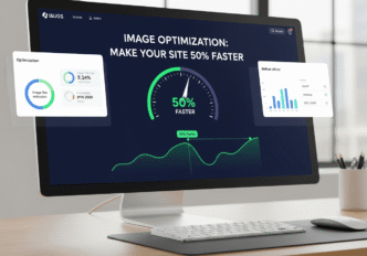
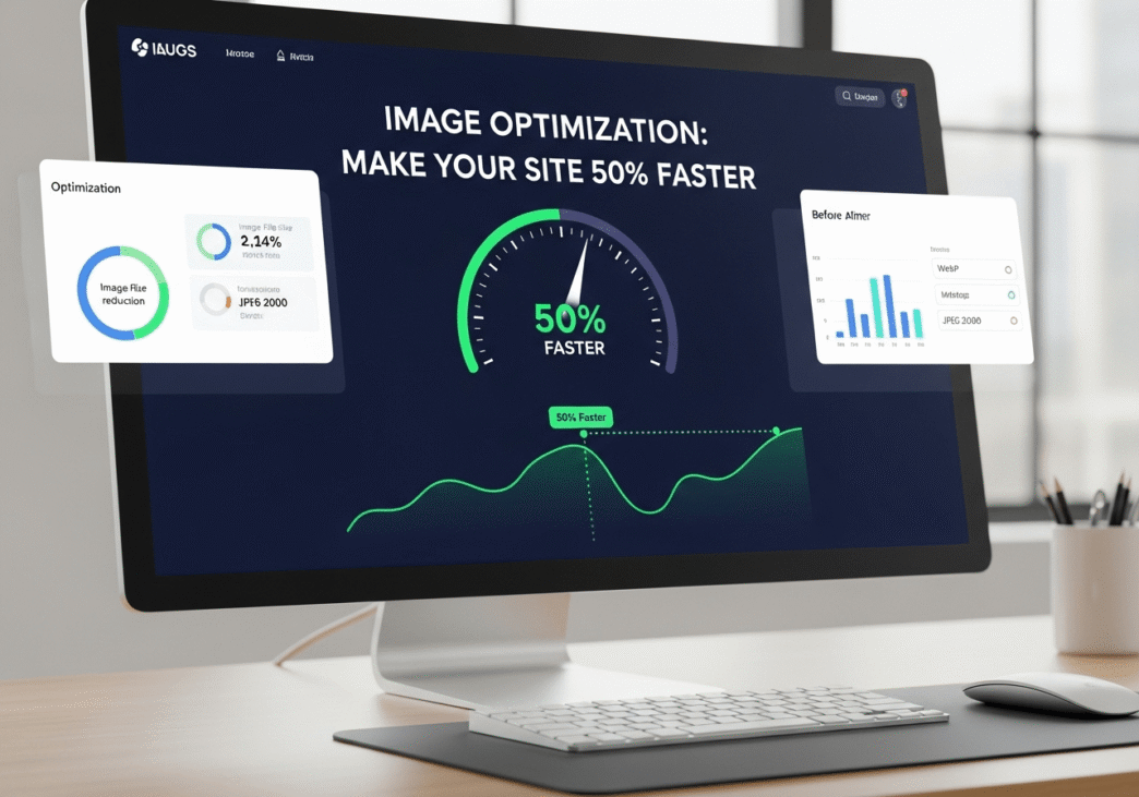
Ready to make your site 50% faster through image optimization? Here’s your systematic approach:
Week 1: Image Audit and Quick Wins
- Audit your current images using browser developer tools to identify largest files
- Compress your top 10 largest images using TinyPNG or similar tool
- Convert hero images to WebP with JPEG fallbacks for browser compatibility
- Test page speed improvements and document the impact
- Set up image optimization tools for ongoing use
Week 2: Systematic Optimization
- Implement lazy loading for all below-the-fold images
- Create responsive image versions for mobile, tablet, and desktop
- Optimize all existing images using batch processing tools
- Set up WebP conversion workflow for new images
- Monitor performance improvements across key pages
Week 3: Advanced Implementation
- Implement progressive image loading for better perceived performance
- Set up automated image optimization for new uploads
- Create image performance monitoring to track ongoing impact
- Optimize image delivery with CDN integration
- Test advanced formats like AVIF for cutting-edge browsers
Week 4: Maintenance and Monitoring
- Create image optimization guidelines for team members
- Set up performance budgets for image file sizes
- Implement automated testing for image performance regression
- Plan ongoing optimization strategy for new content
- Correlate image improvements with business metrics
Frequently Asked Questions About Image Optimization
What’s the best image format for website speed?
Answer: WebP is currently the best overall format for web speed, offering 25-35% better compression than JPEG and 50% better than PNG. However, always provide JPEG/PNG fallbacks for older browsers. AVIF is even better but has limited browser support currently.
How much can I compress images without losing quality?
Answer: For JPEG images, 70-80% quality typically provides excellent results with minimal visible quality loss. For hero images, use 80-85%. For thumbnails and background images, 60-70% is often acceptable. Always test compression levels with your specific images.
Should I use lazy loading for all images?
Answer: Don’t lazy load above-the-fold images as this can hurt performance. Only lazy load images that appear below the initial viewport. Critical images like hero images and logos should load immediately using loading="eager".
What’s the ideal image file size for web?
Answer: Aim for under 200KB for most web images. Hero images can be larger (300-500KB) if necessary, but thumbnail and content images should be much smaller (50-150KB). The key is balancing visual quality with file size based on the image’s importance.
Do I need different image sizes for mobile?
Answer: Yes, absolutely! Mobile devices benefit significantly from smaller image files. Create mobile-specific versions that are 30-50% smaller than desktop versions. Use responsive images or the picture element to serve appropriate sizes for different devices.
Image optimization is the fastest way to dramatically improve your website’s performance. Unlike complex server optimizations or code restructuring, image compression and format optimization can cut your page load times in half with relatively simple implementations.
Start with your largest images first – these provide the biggest impact for your optimization efforts. Then systematically work through your entire image library, implementing modern formats, responsive images, and smart loading strategies.
Remember, image optimization isn’t a one-time task. As you add new content, make image optimization part of your workflow. The sites that consistently optimize their images will maintain performance advantages while their competitors struggle with bloated, slow-loading pages.
For more advanced strategies on optimizing overall website performance beyond just images, check out our comprehensive guide: Website Speed: Why Every Second Counts for Rankings. The complete performance optimization techniques in that resource will help you create a holistic speed strategy that maximizes your image optimization efforts.
What’s been your biggest image optimization win? Share your before and after results and any surprising discoveries about image performance in the comments below!