Ever been reading an article online, about to click a link, when WHAM! – the entire page jumps and you accidentally click on an ad for discount lawn mowers instead? Welcome to the infuriating world of layout shifts, my friend.
You’re not alone in this digital dance of frustration. Cumulative Layout Shift (CLS) is one of those sneaky user experience killers that can make even the most patient visitors want to throw their devices out the window. The good news? CLS optimization is totally fixable once you know what you’re doing.
This comprehensive guide will walk you through everything you need to know about achieving perfect layout stability and creating a visual stability experience that’ll make your users actually want to stay on your site. Ready to stop those annoying page layout shifts once and for all?
Table of Contents
Toggle
What Exactly Is Cumulative Layout Shift (CLS)?
Cumulative Layout Shift measures how much your page elements move around unexpectedly while loading. Think of it as Google’s way of measuring the “jumpiness” of your website.
Imagine you’re trying to read a book, but the words keep moving around the page while you’re reading. That’s essentially what a poor CLS score feels like to your users.
CLS is part of Google’s Core Web Vitals metrics, and it directly impacts both user experience and search rankings. Unlike other metrics measured in time, CLS uses a unit-less score based on the impact and distance of layout shifts.
CLS Scoring Thresholds:
- Good: Less than 0.1
- Needs Improvement: 0.1 to 0.25
- Poor: More than 0.25
Pro Tip: CLS is measured throughout the entire lifespan of a page, not just during initial loading. This means even delayed content loading can hurt your score if not handled properly.
Why Should You Care About Layout Stability?
Layout stability isn’t just a technical metric – it’s a direct reflection of user frustration levels. Poor visual stability leads to:
- Accidental clicks on wrong elements (hello, unwanted purchases!)
- Lost reading position causing users to abandon content
- Reduced trust in your website’s quality
- Higher bounce rates and lower engagement
- Poor search rankings due to bad Core Web Vitals scores
Studies show that users are 25% more likely to abandon a page with significant layout shifts. That’s literally a quarter of your potential audience walking away because your page won’t sit still!
What Causes Those Annoying Page Layout Shifts?
Understanding the root causes is essential for effective CLS optimization. Here are the biggest culprits behind cumulative layout shift problems:
Images Without Dimensions
The #1 cause of layout shifts! When browsers don’t know an image’s size beforehand, they reserve zero space, then jump the content around when the image loads.
Web Fonts Loading
Custom fonts can cause text to reflow when they replace fallback fonts, especially if the fonts have different dimensions.
Ads and Embeds
Third-party content like ads, social media embeds, and widgets often load after the page, pushing existing content around.
Dynamic Content Injection
JavaScript that adds content to the page without reserving space first is a major layout shift prevention challenge.
CSS Animations and Transitions
Poorly implemented animations can trigger unexpected layout recalculations and shifts.
How to Fix Cumulative Layout Shift: The Complete Guide
Ready for some cumulative layout shift solutions? Let’s dive into proven strategies that actually work:
1. Always Include Image Dimensions
This is the easiest win in CLS score improvement:
<!-- Bad: No dimensions -->
<img src="hero-image.jpg" alt="Hero image">

<!-- Good: Include width and height -->
<img src="hero-image.jpg" alt="Hero image" width="800" height="400">

<!-- Better: Use aspect-ratio CSS -->
<img src="hero-image.jpg" alt="Hero image" style="aspect-ratio: 16/9;">
Pro Tip: Modern browsers automatically calculate aspect ratios from width and height attributes, even with responsive CSS. This means you can have responsive images AND layout stability.
2. Reserve Space for Ads and Embeds
Create containers with fixed dimensions for third-party content:
.ad-container {
  width: 300px;
  height: 250px;
  background-color: #f0f0f0;
}

.embed-container {
  aspect-ratio: 16/9;
  background: linear-gradient(90deg, #f0f0f0 25%, transparent 25%);
}
This technique is called “skeleton loading” and it’s a game-changer for layout shift prevention.
3. Optimize Web Font Loading
Implement proper font loading strategies to prevent text reflow:
/* Use font-display: swap for better CLS */
@font-face {
  font-family: 'CustomFont';
  src: url('custom-font.woff2') format('woff2');
  font-display: swap;
}

/* Preload critical fonts */
<link rel="preload" href="critical-font.woff2" as="font" type="font/woff2" crossorigin>
4. Smart Dynamic Content Handling
When adding content dynamically, always reserve space first:
// Bad: Injecting content without space reservation
document.querySelector('.content').innerHTML += newContent;

// Good: Reserve space before injection
const container = document.querySelector('.content');
container.style.minHeight = calculateContentHeight(newContent) + 'px';
container.innerHTML += newContent;
Prevent Layout Shifts CSS: Advanced Techniques
Here are some advanced prevent layout shifts CSS techniques that professional developers swear by:
CSS Grid for Stable Layouts
CSS Grid is inherently more stable than flexbox for complex layouts:
.grid-container {
  display: grid;
  grid-template-columns: 1fr 300px;
  grid-template-rows: auto 1fr auto;
  min-height: 100vh;
}

.content { grid-area: 1 / 1 / 2 / 2; }
.sidebar { grid-area: 1 / 2 / 2 / 3; }
.footer { grid-area: 3 / 1 / 4 / 3; }
Container Queries for Responsive Stability
Use container queries to maintain layout stability across different screen sizes:
.card-container {
  container-type: inline-size;
}

@container (min-width: 300px) {
  .card {
    aspect-ratio: 16/9;
    min-height: 200px;
  }
}
Transform-Based Animations
Use transforms instead of changing layout properties for animations:
/* Bad: Causes layout shifts */
.element:hover {
  width: 120%;
  height: 120%;
}

/* Good: No layout impact */
.element:hover {
  transform: scale(1.2);
}
CLS Optimization Best Practices: The Professional Approach
Here are the CLS optimization best practices that separate amateur sites from professional ones:
| Practice | Impact Level | Implementation Difficulty | Time to Results |
|---|---|---|---|
| Image dimensions | High | Easy | Immediate |
| Font optimization | Medium | Medium | 1-2 days |
| Ad space reservation | High | Medium | Immediate |
| CSS Grid adoption | Medium | Hard | 1-2 weeks |
| Animation optimization | Low | Easy | Immediate |
| Dynamic content handling | High | Hard | 1-2 weeks |
Priority Order for Maximum Impact:
- Fix image dimensions (biggest bang for your buck)
- Reserve space for ads/embeds (high impact, medium effort)
- Optimize font loading (prevents text-related shifts)
- Audit animations and transitions (quick wins)
- Refactor dynamic content (long-term stability)
Pro Tip: Start with the easy wins first. Fixing image dimensions alone can improve your CLS score by 60-80% on most websites.
Real-World Case Study: News Website CLS Transformation
Let me share a fascinating reduce layout shift score success story:
The Challenge: A popular news website had a CLS score of 0.35 (Poor), causing reader complaints about “jumpy articles” and accidental ad clicks.
The Problems Identified:
- Hero images without dimensions (contributing 0.18 to CLS)
- Late-loading banner ads pushing content down (0.12 to CLS)
- Custom web fonts causing text reflow (0.05 to CLS)
- Social media embeds loading asynchronously
The Solutions Implemented:
- Image Optimization: Added explicit dimensions to all images and implemented aspect-ratio CSS
- Ad Space Reservation: Created fixed-height containers for all ad slots with skeleton loading
- Font Strategy: Implemented font-display: swap and preloaded critical fonts
- Embed Containers: Reserved space for social media embeds with placeholder content
The Implementation Timeline:
- Week 1: Image dimensions and basic ad containers
- Week 2: Font optimization and embed placeholders
- Week 3: Fine-tuning and mobile optimization
- Week 4: Monitoring and minor adjustments
The Results:
- CLS score: Improved from 0.35 to 0.06 (Good)
- User engagement: 40% increase in article completion rates
- Ad revenue: 25% increase due to fewer accidental clicks leading to better ad targeting
- SEO impact: 15% improvement in search rankings for target keywords
- User complaints: 90% reduction in layout-related support tickets
Pro Tip: The biggest surprise was the ad revenue increase. Counter-intuitively, fewer accidental clicks led to higher-quality engagement and better ad performance.
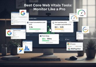
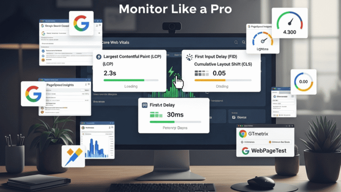
Tools for Measuring and Monitoring CLS Performance
Here are the best tools for tracking your web vitals stability:
| Tool | CLS Detection | Best Use Case | Visual Debugging | Cost |
|---|---|---|---|---|
| Chrome DevTools | ✅ Real-time | Development debugging | ✅ Excellent | Free |
| PageSpeed Insights | ✅ Lab + Field data | Quick assessment | ✅ Good | Free |
| Web Vitals Extension | ✅ Live monitoring | Real-time analysis | ✅ Basic | Free |
| Lighthouse | ✅ Comprehensive | Full audits | ✅ Detailed | Free |
| WebPageTest | ✅ Advanced | Performance testing | ✅ Advanced | Free/Premium |
| Search Console | ✅ Real user data | Long-term monitoring | ❌ None | Free |
Pro Debugging Workflow:
- Use Search Console to identify pages with CLS issues
- Run PageSpeed Insights for specific problem analysis
- Open Chrome DevTools for detailed element-by-element debugging
- Test fixes with the Web Vitals extension in real-time
Common CLS Optimization Mistakes to Avoid
Learn from these common layout shift prevention pitfalls:
Mistake 1: Over-Optimizing for Lab Data
Lab tests don’t always reflect real user experiences. Focus on Real User Monitoring (RUM) data from actual visitors.
Mistake 2: Ignoring Mobile Layout Shifts
Mobile devices often have different CLS patterns than desktop. Test on actual devices, not just browser emulation.
Mistake 3: Forgetting About Dynamic Content
Content that loads after user interactions (like “Load More” buttons) can still cause layout shifts if not handled properly.
Mistake 4: Using Placeholder Dimensions That Don’t Match
If your placeholder is 300px tall but your content is 400px, you’ll still get a layout shift when the real content loads.
Advanced CLS Optimization Strategies
Ready to take your user experience metrics to the next level? Here are some advanced techniques:
Intersection Observer for Smart Loading
Use Intersection Observer to load content only when needed, with proper space reservation:
const observer = new IntersectionObserver((entries) => {
  entries.forEach(entry => {
    if (entry.isIntersecting) {
      // Reserve space before loading
      entry.target.style.minHeight = '200px';
      loadContent(entry.target);
    }
  });
});
CSS Containment for Performance
Use CSS containment to limit layout recalculation scope:
.article-card {
  contain: layout style paint;
}

.sidebar {
  contain: layout;
}
Progressive Enhancement Approach
Build your layout mobile-first with progressive enhancement:
/* Mobile-first base layout */
.container {
  display: block;
}

/* Enhanced layout for larger screens */
@media (min-width: 768px) {
  .container {
    display: grid;
    grid-template-columns: 2fr 1fr;
  }
}
The Future of Layout Stability
As web technologies evolve, visual stability is becoming even more critical. Here’s what’s coming:
- Better browser APIs for layout prediction
- Improved font loading with variable fonts
- Smarter ad platforms with built-in CLS optimization
- AI-powered layout optimization tools
The key is building layout stability into your development process from day one, not trying to fix it afterward.
Pro Tip: Consider CLS impact during the design phase. Layouts that look great in static mockups might be layout shift nightmares in reality.
Wrapping Up: Your CLS Optimization Action Plan
Here’s your step-by-step plan to achieve perfect CLS optimization:
Week 1: Quick Wins
- Add dimensions to all images using width/height attributes
- Implement aspect-ratio CSS for responsive images
- Reserve space for ads with fixed-height containers
- Test changes using Chrome DevTools
Week 2: Font and Content Optimization
- Optimize web font loading with font-display: swap
- Preload critical fonts for faster rendering
- Create placeholder content for dynamic elements
- Monitor real user data in Search Console
Week 3: Advanced Optimization
- Refactor animations to use transforms instead of layout properties
- Implement skeleton loading for complex components
- Optimize third-party embeds with proper containers
- Set up automated monitoring for ongoing CLS tracking
Week 4: Testing and Refinement
- Test on real devices across different network conditions
- Gather user feedback on layout stability improvements
- Fine-tune based on data from monitoring tools
- Document best practices for your team
Remember, cumulative layout shift optimization isn’t just about hitting a Google metric – it’s about creating genuinely better user experiences. When your pages stay stable and predictable, users can focus on your content instead of fighting with your layout.
The investment in layout shift prevention pays dividends in user satisfaction, engagement metrics, and yes, search rankings too. But more importantly, you’ll sleep better knowing your users aren’t cursing your website for making them accidentally click on things they never intended to.
Want to understand how CLS fits into the bigger picture of Core Web Vitals optimization? Getting the complete performance picture will help you prioritize your optimization efforts for maximum impact.
Have specific layout shift challenges you’re struggling with? Drop a comment below with your site details – I’d love to help you troubleshoot those pesky jumping elements!